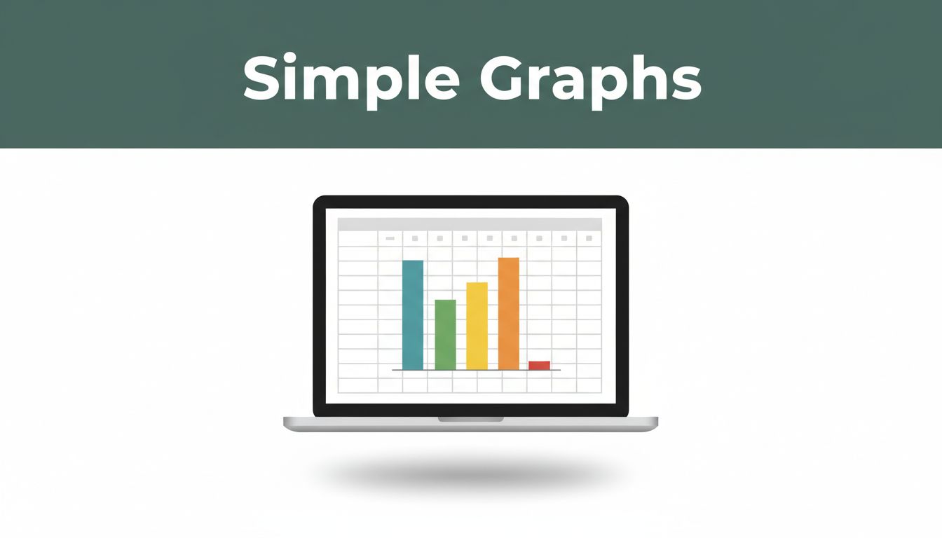
Ever stared at a spreadsheet full of numbers and wished they told a story at a glance? You track your monthly grocery bills or class test scores, but rows and columns just blur together. Simple graphs fix that fast. They turn raw data into visuals anyone grasps right away.
Google Sheets and Excel make this easy. Both tools come free or pre-installed, work on phones or computers, and handle everyday tasks like budget breakdowns or sales trends. You’ll pick the right graph type, prep your data, follow quick steps in either app, and polish for impact. Recent 2026 updates add smarts too, like AI suggestions in Sheets from Gemini or Copilot tweaks in Excel. Stick around. You’ll build your first graph in minutes and share insights like a pro.
Match Your Data to the Perfect Graph Type
Start with the basics. Pick a graph that fits your data’s message. Beginners stick to four types: column, line, pie, and bar. Each shines for certain stories. Column charts compare categories side by side. Line charts track changes over time. Pie charts show parts of a whole. Bar charts handle wordy labels.
Why choose wisely? The wrong graph confuses people. A good one reveals patterns instantly. For example, compare fruit sales with columns. Track temperature rises with lines. Limit pie slices to eight max. Otherwise, slices shrink too small to read.
Here’s a quick comparison to guide you:
| Graph Type | Best For | Example Use Case |
|---|---|---|
| Column | Category comparisons | Sales by fruit type |
| Line | Trends over time | Monthly income changes |
| Pie | Parts of a whole | Budget shares |
| Bar | Long category names | Product review scores |
For more on beginner-friendly options, check Zoho’s guide to chart types.

Column Charts: Compare Categories Side by Side
Column charts use vertical bars. They stack categories next to each other for easy scans. Picture apple versus banana sales. Tallest bar wins. Or test scores by subject. Headers auto-label axes, so setup stays simple.
These work because eyes compare heights naturally. Group up to ten bars without clutter. Sales teams love them for quarterly reviews.
Line Charts: Spot Trends Over Time
Line charts connect data points with smooth lines. They highlight ups and downs over periods. Show sales from January to June. A rising line screams growth. Or daily temperatures. Dips and peaks jump out.
Connections make patterns obvious. Add multiple lines for comparisons, like two products’ progress. Time data goes on the bottom axis always.
Pie Charts: See Shares of the Whole
Pie charts slice a circle into percentages. Each piece shows a portion, like rent taking 40% of your budget. Or survey votes by option. Colors separate slices clearly.
Keep it to eight slices tops. More turns it messy. Pull one slice out for emphasis if needed. Budget planners swear by pies for quick overviews.
Bar Charts: Handle Long Labels with Ease
Bar charts flip columns horizontal. Use them when names spill over, like “Customer satisfaction for extended warranty plans.” Bars stretch left to right. Labels fit without crowding.
They mirror columns but save space vertically. Great for reports with detailed categories.
Set Up Your Data for Smooth Graph Creation
Clean data builds great graphs. Messy sheets cause errors. First, list info in rows and columns. Include headers on row one, like “Month” or “Sales.” No blank cells or merged boxes. They confuse tools.
Take sample sales: Column A lists Jan, Feb, Mar. Column B has numbers: 100, 150, 200. Sort ascending if needed. In Excel, try PivotTables. They summarize big sets and update graphs automatically when data changes.
Google Sheets handles this too. Use filters to drop duplicates. Tidy data means graphs insert without fixes. Save hours this way. Test on your expense log next.
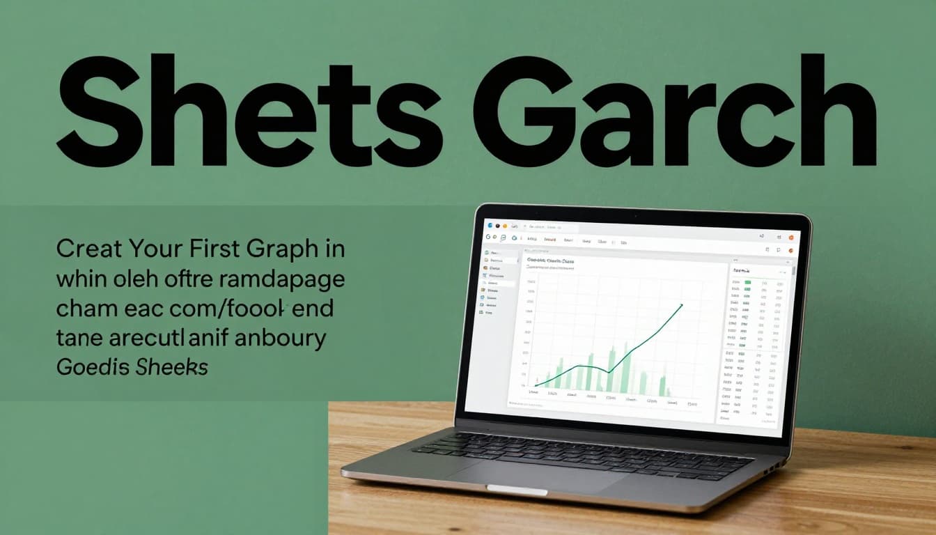
Create Your First Graph in Google Sheets
Google Sheets shines for quick graphs. It’s free online, shares easy, and runs on any device. March 2026 brought Gemini AI perks. Type a prompt like “chart my sales trends,” and it builds one from your data or even pulls from email.
Start with sample data. Jan sales: 100. Feb: 150. Highlight both columns including headers.
Insert and Pick Your Chart Type Fast
Click the chart icon in toolbar. Or go Insert then Chart. Suggestions pop up based on data. Pick line for trends. Column for categories. Pie shows instantly.
Drag corners to resize. Move by title bar. Done in seconds.
For a full walkthrough, see Coefficient’s Google Sheets graph tutorial.
Customize Colors and Labels in Seconds
Open Chart editor on right. Setup tab picks type or series. Style tab changes colors, fonts, background. Add title like “Monthly Sales Growth.” Label axes: “Months” bottom, “Dollars” left.
Gemini helps here. Prompt “make bars blue and add trendline.” It adjusts fast. Mobile app supports all this too.
Build Graphs Quickly in Microsoft Excel
Excel packs power for desktop users. It links to big files and updates live. 2026 adds Copilot AI. Ask it to “sort this chart data” or edit labels directly on web version.
Use the same sales sample. Select range with headers.
From Data Selection to Chart Insertion
Hit Insert tab. Charts group shows icons. Click Clustered Column for compares. Line with markers for trends. Pie of the Pie for details. Graph appears embedded.
Recommended charts suggest based on data. Pick and go.
WikiHow offers a solid step-by-step for Excel charts.

Add Labels and Polish with the Chart Tools
Click chart. Plus icon adds elements: labels outside end, title above, legend right. Right-click bars for format: change colors or add data callouts.
Copilot tweaks via sidebar. Say “highlight top seller.” PivotCharts link to tables for auto-updates. Pro without hassle.
Boost Your Graphs with Pro Best Practices
Great graphs tell stories. Match type to message first. Keep elements few: one trend or compare max. Use colors sparingly; blues and greens read easy. Avoid rainbows unless categories demand it.
Add clear titles like “Sales Up 50% in Q1.” Label every axis. No legends if bars say it all.
Test dynamic setups. Excel PivotTables or Sheets filters refresh graphs on data changes. Experiment with your budget data. Tweak till insights pop.

Practice builds skill. Start simple, then layer.
Graphs make your data shareable and clear. Follow these steps in Sheets or Excel, and you’ll spot trends or compares everyone gets. Grab your spreadsheet now. Build one graph today with real numbers.
Share your first creation in comments. What data will you visualize? Subscribe for more spreadsheet tricks. You handle visuals like experts already.