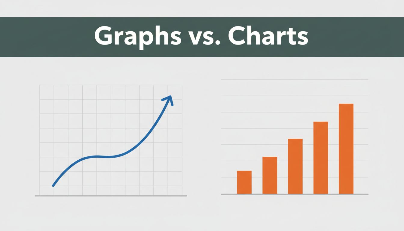
You’ve stared at a line graph of stock prices dipping and rising, then swapped it for a bar chart on sales teams. Confusion hits because both look like data pictures. Yet graphs track changes and links over time, while charts compare categories or show quick snapshots of totals.
This mix-up trips up students in class, business teams in meetings, and anyone pitching ideas. Pick the wrong one, and your audience zones out or gets the facts twisted. Choose right, and data clicks instantly. We’ll break down definitions, types, head-to-head differences, real uses, and 2026 trends. Ready to pick the perfect visual every time?
What Makes Graphs the Go-To for Tracking Changes Over Time
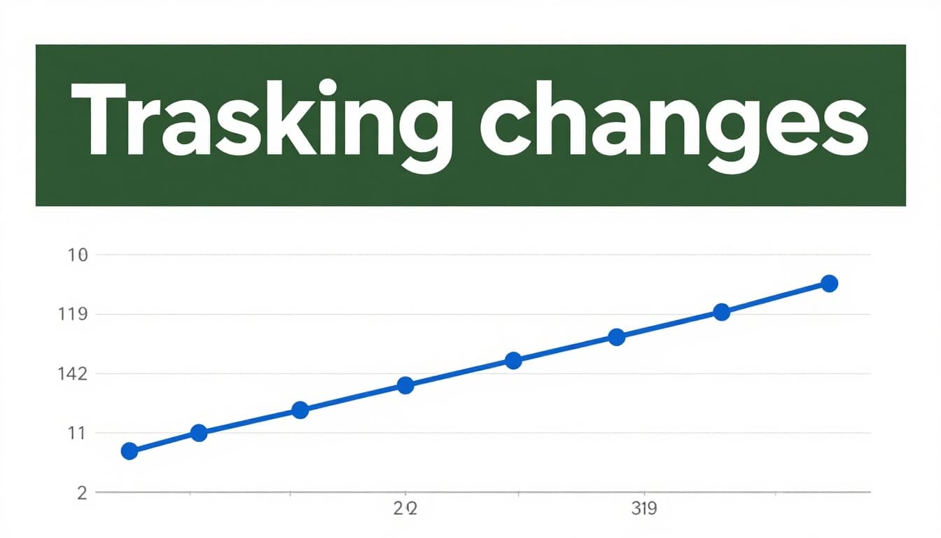
Graphs shine when you need to spot how data moves or connects. They use x and y axes to plot points, lines, or curves. This setup reveals trends, relationships, or exact shifts in continuous info like time series.
Axes form the backbone. The x-axis often marks time or one variable; y-axis shows values. Data points connect with lines or sit alone to highlight patterns. Scientists plot experiments this way. Stock traders watch price lines. Math classes map functions. Graphs demand a close look, so they suit experts chasing details.
For instance, a company tracks website visits daily. A graph shows spikes on weekends. You see the why behind numbers. In short, graphs answer “how does this evolve?”
Everyday Examples of Graphs in Action
Line graphs track smooth changes best. Connect points over months for sales trends. Ice cream shops use them because hot days boost sales; the line proves it.
Scatter plots reveal links between two things. Plot height against weight. Dots cluster to show patterns or outliers. Doctors spot health trends this way.
Label axes clear. Add titles. These steps make graphs pop. They answer connection questions fast. Check Zoho’s guide to graph types for more examples.
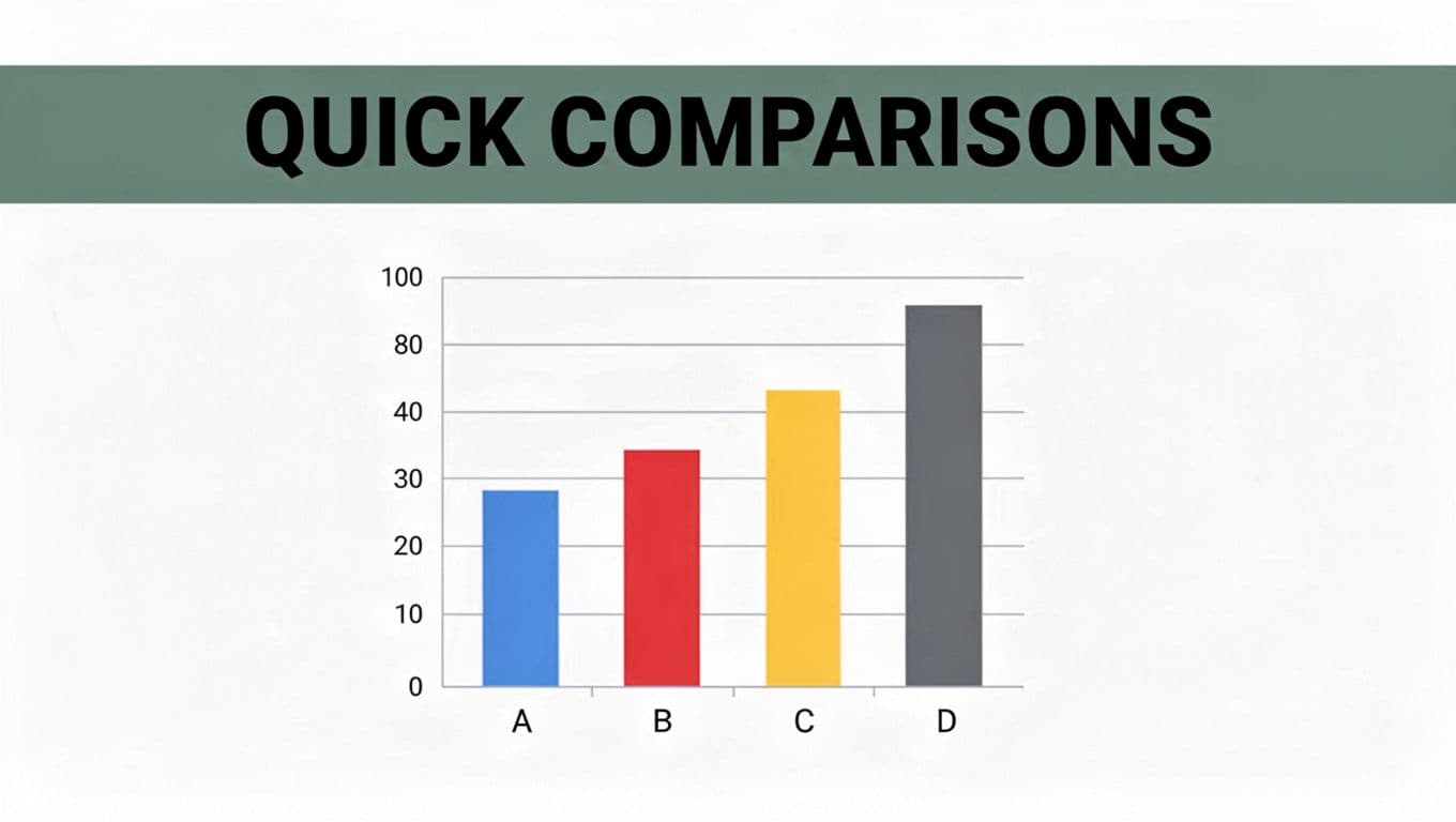
Charts: Perfect for Quick Comparisons and Snapshots
Charts sum up data for instant reads. They include bars, pies, or maps without strict axes. Focus stays on parts of a whole, rankings, or totals. Audiences grasp them in seconds.
Bars rise for categories. Pies slice budgets. These tools simplify reports. Business slides love them because viewers scan and decide. Graphs fit as a chart type sometimes. However, charts prioritize speed over depth.
Sales teams rank products with columns. Budget planners divide expenses. Charts grab eyes without effort.
Must-Know Chart Types That Make Data Pop
Bar charts compare groups side by side. Stack them for layers, like sales by region and product. Top cities by population? Bars nail it.
Pie charts show shares at a glance. A 40% food budget gets the biggest slice. Limit to five or seven parts, or it muddles.
Others help too. Gantt charts timeline projects. Flowcharts map steps.
Market shares fit pies well. Bars win for rankings. Their at-a-glance power suits everyone. See Venngage’s chart breakdown for visuals.
Graphs vs. Charts: Spot the Differences That Actually Matter
Key traits set them apart. Graphs plot relationships on axes. Charts summarize with shapes.
Here’s a quick side-by-side:
| Feature | Graphs | Charts |
|---|---|---|
| Main Focus | Trends, changes, connections | Comparisons, parts, rankings |
| Visuals | Points, lines on x-y axes | Bars, pies, maps, no axes always |
| Complexity | Needs study for details | Grabs attention fast |
| Best For | Science, stocks, math | Business reports, general views |
Graphs reward time spent. Charts hit quick. Now you spot mismatches easy. For project tips, read this practical guide.
Real-World Scenarios: When to Grab a Graph or a Chart
Match the tool to your goal. Time-based trends? Grab a line graph for stock prices. It shows ups and downs clear.
Correlations call for scatter plots. Temperature versus ice cream sales reveals links. Labs rely on these.
Rankings or shares? Use bars or pies. Top populations by city stacks columns neat. Budget breakdowns slice pies.
Business meetings favor charts for speed. Lab reports pick graphs for proof. Ask: Does data flow over time, or sit in groups? Time means graph. Categories mean chart. Stories stick when visuals fit.
Fresh Trends Making Graphs and Charts Smarter in 2026
AI picks visuals now. Type “sales trends,” and tools like Power BI build line graphs or bars. It scans patterns first.
Real-time updates beat static sheets. Dashboards refresh live for prices or customer data. Predictive lines forecast next moves.
Tools lead the pack. Tableau handles complex asks with AI chats. Looker Studio stays free with real-time connectors. Accessibility improves too, with better colors and alt text.
Everyone builds pro visuals fast. Data speaks clearer than ever.
In the end, graphs connect the dots over time; charts highlight what’s big now. Next project, match your pick to the story. Fire up Excel or Google Sheets and test one. What tripped you up before? Share below, and subscribe for more data tricks. You handle visuals like a pro now.
(Word count: 982)