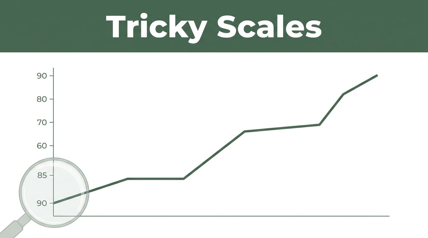
What Are Graphs? Nodes, Edges, and Why They Power Your Daily Tech
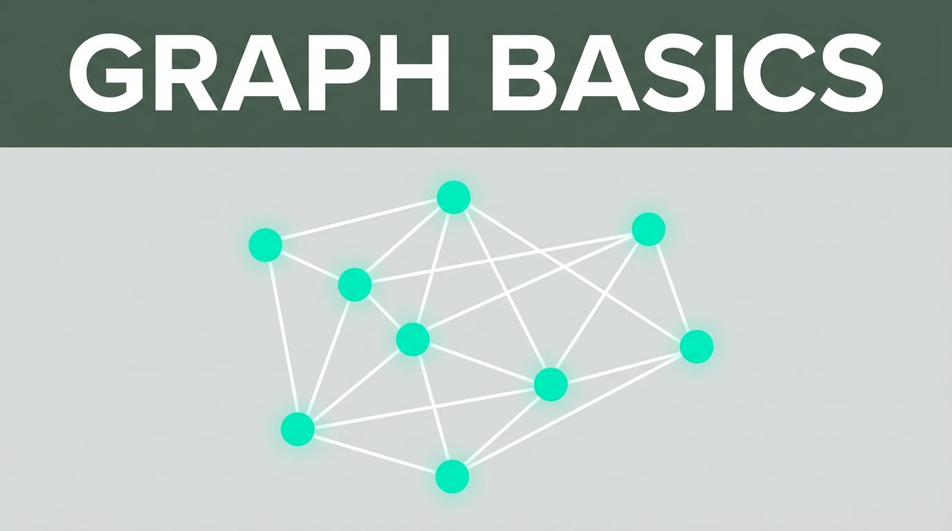
Think about your social media feed. It suggests friends you might know. Or picture your GPS app plotting the fastest way home through traffic. These tools rely on graphs without you noticing. Graphs model connections in the world. They use dots called nodes for things like people or cities. Lines called edges link those nodes … Read more