You glance at your phone bill. Costs climb month after month. A line graph makes that rise crystal clear in seconds. These charts track changes over time, like temperatures swinging daily or sales spiking during holidays. People meet them everywhere: news reports, school tests, work dashboards.
Line graphs shine because they connect dots into stories. You see growth, drops, or plateaus at a glance. Yet many folks stumble on basics. They miss trends or misread scales. This guide fixes that. You’ll master parts of a graph, simple reading steps, trend spotting, common pitfalls, and real examples. School projects get easier. Job reports make sense. Daily decisions sharpen. By the end, you’ll scan any line graph with confidence. Let’s start with the building blocks.
Spot the Key Parts of Every Line Graph Right Away
Every line graph has core pieces. Spot them first, and the rest falls into place. Think of it like a road map. The title points the way. Axes set the directions. Lines draw the path.
Begin here. Check the title up top. It sums up the data, such as “Monthly Sales 2025.” Next, find the axes. The bottom one, the x-axis, often marks time: days, months, years. The side one, the y-axis, shows values: dollars, degrees, percentages.
Units matter too. A y-axis might read “Revenue (in millions).” Skip that, and numbers mislead. Scales vary. One graph starts at zero. Another jumps to 50. Always note the range.
Title and Axis Labels: Your Starting Point
Read the title first. It tells what the graph covers and the time span. For example, “U.S. Unemployment Rate, 2020-2026” sets the scene.
The x-axis runs horizontal. It holds categories or time. Labels might say “Jan, Feb, Mar.” The y-axis stands vertical. It lists numbers, from low to high. Look for arrows pointing up or right. They show direction.
Units hide tricks. Percentages use %. Dollars add $. Thousands get K. Check footnotes too. They clarify details.
Data Points, Lines, and Legends Explained
Dots mark exact values. Each sits at an x-y spot. Lines join them. A smooth line shows steady change. Jagged ones signal ups and downs.
Multiple lines need a legend. It matches colors to items, like “Product A” in blue, “Product B” in red. Place it upper right or bottom. For deeper tips on reading points from lines, see this Carleton College guide.
Grid lines help. They act like graph paper. Follow them to pinpoint values fast.
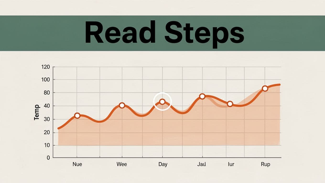
Follow This Easy Step-by-Step to Read Any Line Graph
Reading flows simple. Follow these steps every time. You’ll build speed and accuracy. Practice once, and it sticks.
- Scan the title, axes, and legend. Know the story’s basics.
- Pick a point on the x-axis. Trace up to the line.
- Move left to the y-axis. Note the value.
- Repeat across the line. Watch the path.
- Compare lines if present. Spot leaders or laggards.
That’s it. You control the graph now.
Pick a Spot and Find Its Value Fast
Choose a date, say March 15. Find it on the x-axis. Draw a mental line up. Hit the graph line at the data point. Slide left to y-axis. Read 75 degrees, or $500.
Grid lines speed this. They guide your eye straight. No guessing. Practice on printed graphs. Mark points with a pencil.
Trace the Full Line to See the Story
Start left. Move right. An upward slope means growth. Downward shows decline. Flat lines signal steady.
Grid helps here too. It breaks the line into chunks. Pause at peaks or dips. Note dates. The full sweep reveals patterns.
Unlock Trends and Changes Hidden in the Lines
Lines tell more than points. They whisper big stories. Spot overall direction first. Then hunt details.
Time-based graphs excel here. Weekly temperatures wave up and down. Yearly sales climb with seasons. Compare slopes between lines. Steeper wins.
In March 2026, Western U.S. heat domes pushed lines sky-high. Phoenix hit 106°F, far above normal. Such graphs warn of climate shifts.
Rise, Fall, or Steady: What Each Means
Upward lines grow. Enrollment rises as slopes climb. Businesses love this.
Downward drops costs or values. Savings appear. Steady flats hold even. No big shifts.
Rates matter. Gentle uptakes build slow. Steep ones explode.
Catch Peaks, Valleys, and Surprises
Peaks mark highs. Sales top out in December. Valleys hit lows, like summer slumps.
Steep jumps signal events. A sudden drop? Recession hint. For basics on interpreting visualizations, check this Wake Forest University resource.
Surprises pop as breaks. Smooth lines rarely kink without cause.
Dodge These Sneaky Mistakes That Fool Everyone
Errors trip up smart people. Avoid them with checks. Here’s what bites most.
- Rush past title. Miss the topic.
- Ignore scales. Small changes look huge.
- Focus one point. Trends hide.
- Swap axes. Time isn’t values.
- Skip legend. Lines blur.
Fixes work quick. Pause. Double-check.
Forgetting Scales and Units
Y-axes trick eyes. One starts at zero. Another at 90%. The second exaggerates ups.
Always eye the full range. Note units. Millions differ from thousands. This keeps views honest.
Overlooking the Big Picture Trend
Single points tempt. But lines live in motion. Scan left to right. Overall up? Growth rules.
Zoom out. One dip rarely defines. Patterns persist.
See Line Graphs in Action with Everyday Examples
Graphs live in news and reports. Spot them daily. Let’s unpack five.
First, temperatures. March 2026 New York lines showed daily highs and lows. Waves revealed mild starts, warmer ends.
Sales next. Holidays spike lines. Black Friday peaks tower.
Stocks compare firms. One line soars, others lag.
Phone plans track costs. Steady climbs prompt switches.
EV sales in Q1 2026 dropped 28% for new, but used surged 12%. Dual lines split the story, per Electrek’s chart.
Tracking Temperature or Sales Over Time
Week temps wavy. Midweek peaks hit 80°F. Sales lines jump end-year. Trends predict next seasons.
Comparing Competitors Like Stocks or Plans
Waymo rides rocketed in 2026. Their line outpaced rivals, as TechCrunch charted.
Fund flows hit near-records February 2026. Lines showed bond leads.
Hunt your own. News sites abound. Practice builds skill. For graph construction basics, see this economics appendix.
Line graphs unlock data fast. Master parts, steps, trends. Skip pitfalls. Real examples prove it.
Grab a news graph today. Read it aloud. Spot the story. Share yours below. What trend surprised you? Subscribe for more tips on charts and numbers. You’ve got this.