Picture your local ice cream shop at the end of summer. Chocolate scoops fly out the door. Vanilla sells steady. Strawberry lags behind. A quick bar graph reveals the winner: tall bar for chocolate, medium for vanilla, short for strawberry.
These charts use rectangular bars to compare categories. Bar height or length matches the value. You spot differences at a glance. Businesses track sales this way. Schools teach math. News shows poll results. Simple and clear.
We’ll cover the basics, types, best times to use one, tips for great ones, and examples. Plus, 2026 trends. Ever wondered why bars beat pie charts sometimes? Keep reading.
Breaking Down the Basics: What Exactly Is a Bar Graph?
Bar graphs shine for comparing categories. Think fruits in a basket: apples, oranges, bananas. Each gets a bar. Taller bar means more apples sold. Bars stand side by side with space between. No touching, unlike histograms.
The x-axis lists categories like fruit names. Y-axis shows values, say number sold. Always start y-axis at zero. Gaps prevent tricks. Title tops it off. Labels explain axes. Equal bar widths keep it fair.
People grasp them fast because eyes judge length easy. No math needed. They handle counts, ratings, frequencies. Not for smooth changes over time, though.
For a deeper look at structure, check this bar graph tutorial on GeeksforGeeks.
The Essential Parts Every Bar Graph Needs
Bars form the core. They represent values with length. Make them equal width. Add space between for clarity.
X-axis holds categories. Keep labels short or rotate. Y-axis marks values. Start at zero always. Skip that, and scales mislead.
Titles tell the story. “Fruit Sales Last Week” works. Legends explain colors if multiple series. Clear fonts help. These parts stop confusion. Readers get the point in seconds.
Types of Bar Graphs: Pick the Right One for Your Data
Choose based on data and labels. Vertical bars suit short categories. Horizontal fit long ones. Grouped show sub-groups. Stacked reveal parts of wholes. Variwide handles two values at once, but stick to basics first.
Vertical graphs plot categories on bottom, values up. Quick for few items. Horizontal flip it: categories on side, values across. Readability wins for city names or products.
Each type serves categorical data. Bars stay separate. No lines connecting.
See more variations in this guide to bar chart types.
Vertical vs Horizontal: Which Fits Your Story?
Vertical bars stack categories below. Values rise up. They excel with 5-10 short labels. Eyes scan left to right easy. However, long names crowd the base.
Horizontal bars run sideways. Categories list on y-axis. Great for 10+ items or wordy labels like “San Francisco Coffee Shop.” Values stretch right. No squint needed.
Pick vertical for quick hits. Go horizontal for detail. Test both. Reader comfort matters most.
Grouped and Stacked: Handling Multiple Data Layers
Grouped bars cluster side by side. Compare sub-groups, like boys vs girls in a survey. Each cluster one category. Colors differ per sub-group.
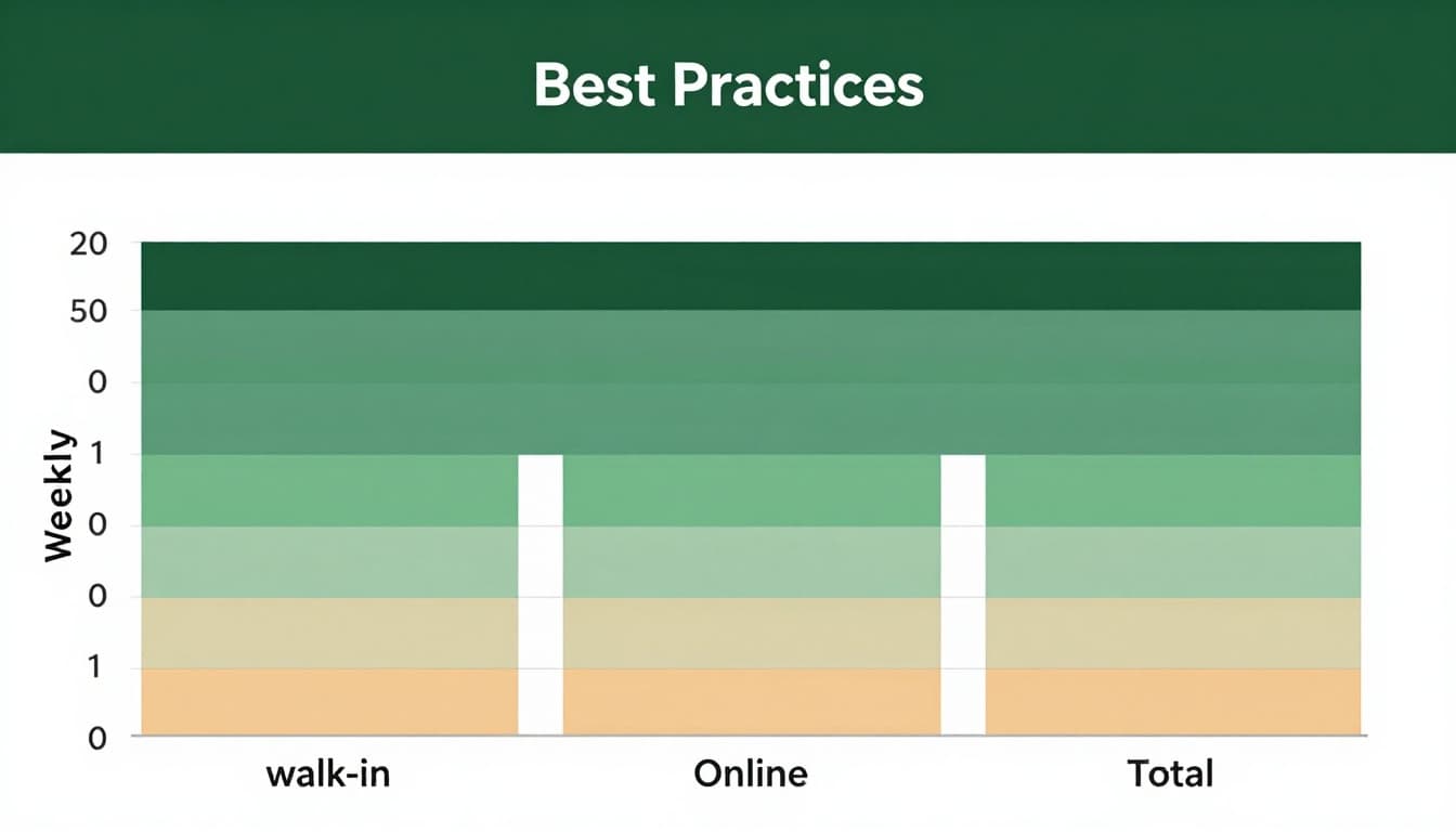
Stacked bars build upward. Show parts adding to total. Weekly customers: walk-in bottom, online middle, total top. See shares at a glance.
Grouped shines for direct compares. Stacked fits compositions. Variwide tweaks width for extra info, but use sparingly.
When to Use a Bar Graph (and When to Choose Something Else)
Bar graphs compare sizes fast. Spot leaders, laggards. Perfect for categories like products, regions, preferences. Counts pop. Differences stand out.
They beat others for discrete groups. Monthly sales by item? Bars win. Survey votes? Yes. Frequencies? Spot on.
However, skip for time trends. Lines connect changes better. Proportions alone? Pie for few slices.
This chart types guide compares bars to lines and pies clearly.
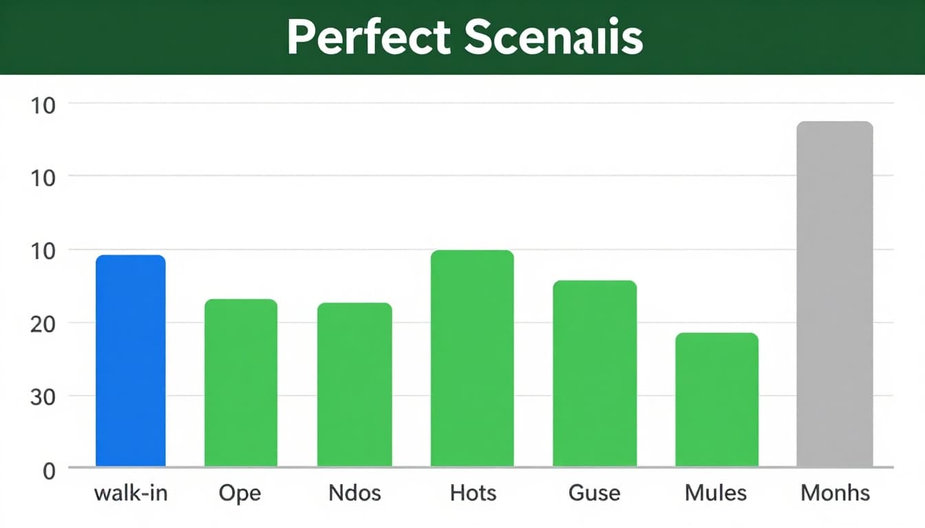
Perfect Scenarios Where Bar Graphs Excel
Sales by product shine. Tallest bar shows top seller. Survey results, like favorite pets, rank easy.
Frequencies count votes or visits. Categories stay clear. Bars make winners obvious. No guesswork.
Why? Length compares precise. Eyes judge gaps quick. Data tells the tale.
Common Pitfalls: Skip Bar Graphs Here
Time series mislead. Bars imply categories, not flow. Use lines instead.
Too many categories overwhelm. Over 15? Group or filter. Parts-to-whole without totals confuse. Pie or stacked only if sums matter.
Continuous data fits histograms. Bars touch there. Know your data type first.
Craft Clear Bar Graphs: Best Practices and Real Examples
Start y-axis at zero. Equal widths, even spacing. Sort bars descending. Simple colors code meaning. Label direct on bars. Skip 3D effects; they distort.
Test readability. Five seconds max to grasp. Tools like Google Charts speed it up.
In 2026, interactive hovers reveal details. AI sorts and predicts. Mobile favors horizontal. Colors suit all vision types.
Follow these Atlassian bar chart tips for pro results.
Step-by-Step Best Practices for Pro-Level Graphs
- Pick type first. Vertical for short lists.
- Scale fair. Zero base, round ticks.
- Label all. Axes, title, data on bars.
- Color smart. Two tones max, patterns for access.
- Simplify. Remove clutter. Add grid if needed.
No axis tricks. Honest graphs build trust.
Real-World Examples That Make Data Stick
Favorite fruits poll: vertical bars. Apples lead at 40%. Oranges 30%. Bananas 20%. Strawberries last. Top choice jumps out.
User sales grouped: months on x. Walk-in blue, online green side by side. Online grows. Compare trends easy.
Shop customers stacked horizontal: days across. Walk-in base, online stacks up. Totals right. Shares clear without math.
These reveal stories fast.
Bar graphs compare categories with clear bars. Know types like vertical, grouped, stacked. Use for sales, surveys; skip time trends. Follow zero starts, simple labels, sorts.
Grab your data. Build one today. Share yours in comments. Try free tools like Google Charts. AI features make 2026 viz smarter and mobile-ready. What graph will you create next?