Imagine scrolling social media in early 2026. You spot a White House graph boasting “American steel is BACK.” Production rose just 1.2%, from 80.8 to 81.8 million tons. Yet the bars tower like a victory. Why? They chopped the y-axis, turning a tiny bump into a fake boom. Community notes exploded, calling out the trick.
Bad graphs like this spread false excitement. They erode trust in reports, pitches, and posts. Good design flips that. It turns raw numbers into clear stories that stick. You avoid confusion and build credibility.
This post covers six common graph design mistakes: truncated y-axes, wrong chart types, color overload, missing labels, 3D clutter, and inconsistent scales. You’ll get simple fixes with examples. Plus, peek at 2026 trends like AI tools and interactive charts. Ready to fix your graphs today?
Truncated Y-Axes That Turn Tiny Changes into Huge Wins
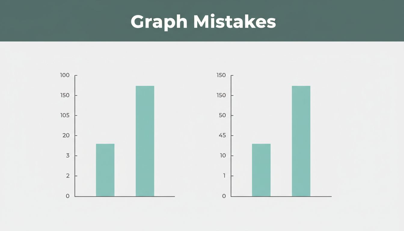
You start the y-axis above zero. Small shifts look enormous. A 5% sales bump seems like 50%. Viewers cheer, but the data lies.
This hurts because it tricks the eye. Brains judge height fast. False slopes lead to bad calls, like overhyping weak growth. Data viz pros rank this as a top error. For deeper dives, check Observable’s guide on y-axis cropping.
Fix it with the zero baseline. Bar charts demand full height from zero. Line charts can shift for tight percentages. Always add a note: “Y-axis starts at 90% for clarity; zero line shown.” Or use a secondary axis for context.
Take sales data. Before: axis from 90 to 100, 5% gain looks doubled. After: zero start reveals truth. Add an annotation arrow. Trust jumps.
Spotting the Deception in Your Own Graphs
Look for axes missing zero. Bars or lines spike without base? Red flag. Business reports love this for “wins.” Ads too.
Your brain reads slopes wrong. Steep ones scream change, even if tiny. Pause now. Grab your last graph. Does it play fair?
Ads often truncate to hype deals. Check claims against full data. Audit forces honesty.
The Zero Rule and Smart Workarounds
First, set y-axis to zero in your tool. Excel or Google Sheets makes it easy. Click axis, edit scale.
Next, add a dashed zero line if cropped. Bold text explains: “Scale zoomed; true zero below.” Test on a friend.
Break rules for stocks or rates under 1%. Show full range anyway. Dual axes help compare big and small. Results stay clear.
Wrong Chart Types That Confuse Your Key Message
Pies with 10 slices? Lines for categories? Bars for years of trends? Chaos follows.
Pies muddle comparisons beyond four parts. Lines imply time flow on static groups. Bars cram endless timelines. Pick wrong, and your story vanishes.
Use this quick picker:
| Data Goal | Best Chart | Why It Works |
|---|---|---|
| Compare sizes | Bar | Easy height reads |
| Show time trends | Line | Smooth changes |
| Few whole parts | Pie | Simple shares |
| Spot relationships | Scatter | Patterns emerge |
One chart per point keeps focus. See Luzmo’s chart types overview for matches. Election pies flop with parties; bars win.
Telltale Signs Your Chart Type Is Off
Pies explode with slices? Viewers squint. Lines on categories wiggle fake trends. Bars stretch across decades? Lose the thread.
Too many variables hide peaks. Election data in pies confuses votes. Switch or fail.
Switch to These Chart Winners Instead
Match goal first. Categories? Horizontal bars. Time series? Lines shine.
Pros of bars: quick scans. Cons of pies: poor precision. Example: regional sales in bars beats pie mess. Data speaks.
Color Overload Turning Data into Eye-Strain
Rainbows hit every bar. Reds, blues, greens clash. Order blurs; eyes tire.
No focal point emerges. Brains overload on hues. Scans slow; messages fade.
Grays for most. Bold one color for stars. Limit to three shades. Color-blind palettes help all. Sales lines clean up fast.
Before: rainbow mess. After: gray backdrop, orange hero line. Insight pops.
Why Too Many Colors Backfire on Readability
Cognitive load spikes. Studies show viewers miss patterns in chaos. Frustration builds; they bounce.
Similar hues blend. Reds signal alarm wrong. Keep it simple.
Build a Simple Color Strategy That Pops
Purpose guides: highlight key metric orange. Backgrounds gray.
Tools like ColorBrewer suggest safe sets. Test prints. Friends confirm: does it scan in five seconds?
Missing Labels Leaving Readers in the Dark
No title? Bare axes? Guesswork rules. Units vanish; legends hide.
Viewers puzzle instead of grasp. Your point dies.
Label all: descriptive title, x/y with units, zero ticks even. Legend clear. Source note. “So what?” box.
Bare sales bars confuse. Labeled version screams: “Q1 up 20% YoY.”
For examples of label fails, see GoodData’s bad viz list.
Common Label Gaps That Kill Clarity
- No title or vague ones
- Axes lack units (%, $?)
- Missing legends
- Uneven ticks skip context
- No baselines
Checklist saves time.
Label Like a Pro for Instant Understanding
Template: “Title: What + Trend.” Axes: “X: Category (units).” Y: “Value ($).” Font 12pt min.
Even spacing. Bold key numbers. Instant “aha.”
3D Tricks and Clutter Hiding Your Real Data
3D pies twist slices. Bars block views. Lines cross; fonts shrink.
Distortion warps sizes. Overload buries facts. Eyes hunt in vain.
Go 2D flat. Filter top five items. Big fonts, square frames. One story rules.
Interactive zooms handle big sets. Simpler wins.
Flashy 3D That Actually Obscures Facts
3D pie fattens front slices. Bars hide neighbors. 2D reveals true shares.
Crammed timelines tangle. Flat bars align clean.
Declutter for Sharp, Honest Visuals
Purge extras: top 80% data only. White space breathes.
Less lines, bigger elements. Focus sharpens.
Inconsistent Scales Making Comparisons Impossible
Bars same height hide 13% vs. 52%. Busy grids distract.
Gaps vanish; stories lie. Viewers miss truths.
Scale matches data: bar tops at max value. Even steps. One focus.
Interactivity lets drill-down. Clean design ties it.
When Your Bars Lie About the Differences
Equal heights trick equals. Check ratios. Spot the cheat.
Scale Fairly to Show True Stories
Baseline zero. Steps like 10,20,30. Proportions match reality.
2026 Trends and Tools for Next-Level Graphs
Actionable insights beat raw dumps. AI spots errors, picks types. Interactive hovers reveal details.
Minimalist grays plus pop color rule. Mobile-first, real-time updates. No 3D; friend tests confirm.
Free tools: Tableau for AI queries, Ajelix BI dashboards. Trends from recent viz reports.
AI and Interactivity Changing the Game
AI asks: “Fix this axis?” Instant tweaks. Hover zooms live data.
Dashboards filter on fly. Decisions speed up.
Minimalist Designs That Wow in 2026
Clean lines, subtle animations. Compress big sets smart.
Mobile tips: thumb-friendly taps. Simplicity drives shares.
Graphs build trust when clear. Fix these six mistakes: truncated axes, wrong types, color mess, label gaps, 3D clutter, scale tricks.
- Start y-axes at zero or note breaks.
- Match charts to data goals.
- Limit colors to three.
- Label everything boldly.
- Stay 2D and declutter.
- Scale proportions true.
Review your last graph now. Apply one fix. Share before/after in comments. Subscribe for data tips. Download our checklist below.
Clear graphs change minds. They spark real action.