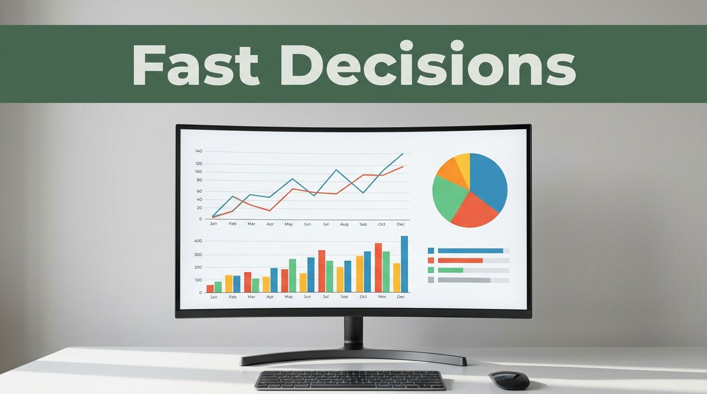
Business leaders in 2026 spend hours sifting spreadsheets. Charts cut that time to seconds. Teams spot sales drops or trends instantly, so they act before problems grow.
You know the drill. Raw numbers bury insights in rows and columns. Charts turn data into pictures everyone grasps fast. They reveal patterns, flag issues, and highlight wins. No more debates over what the figures mean.
This post covers why charts speed decisions, top types with real uses, 2026 trends like AI boosts, key tools big firms pick, and tips for quick results. You’ll see examples from companies saving time and money. Ready to make charts your edge?
Why Charts Let Businesses Decide Faster and Better
Your brain handles visuals 60,000 times faster than text. A line graph shows a revenue dip right away. You don’t hunt through cells or reports.
Charts beat spreadsheets because they simplify. Spreadsheets hide outliers in formulas. Text reports take days to scan. In fast markets, that lag costs sales. Charts align teams on one clear view.
Key wins include spotting trends early. A supply chain glitch appears as a red spike. Fix it before stock runs out. Errors drop too. Visuals cut mistakes by making data obvious.
Teams buy in quicker. Share a bar chart of costs. Everyone nods and moves. Static files fail here. They overload with details.
Consider this analogy. Charts act like a car dashboard. You glance and adjust speed. Spreadsheets? That’s reading the manual mid-drive.
Real-time data shows visuals double user independence. It jumps from 23% to 48%. Firms with charts gain customers 23 times better. They profit 19 times more.
Here are core reasons charts win:
- Spot patterns and outliers fast.
- Reduce errors from misreads.
- Build agreement without long talks.
- Save money on early fixes.
In short, charts sharpen accuracy and pace.
Pick the Perfect Chart: Top Types Businesses Use Every Day
Wrong charts confuse. Match type to your question. Bar for compares, line for time shifts. Businesses pick these daily for clear calls.

Bar Charts: Compare Options Side by Side
Bar charts shine for categories. Stack products or regions. Bars grow tall for top sellers.
Say sales hit $100k for widgets, $60k for gadgets. Bars show widgets lead. Cut gadgets? Decision made in seconds.
Vertical works for few items. Horizontal fits long labels like city names. Simple power drives cuts or boosts.
For more on types, check Zoho’s guide to charts.
Line Graphs: See Trends Over Time at a Glance
Lines track changes. Plot monthly revenue. A dip in July screams seasonal slump.
Marketing ramps up. Complaints rise on the line. Teams tweak service fast. No digging needed.
Multiple lines compare channels. Email pulls ahead? Shift budget there.
Scatter Plots and Heatmaps: Uncover Hidden Links and Hot Spots
Scatter plots link variables. Dots cluster where ad spend ties to sales. Strong link? Double down.
Heatmaps glow red for risks. Warehouse zones slow? Red squares pinpoint fixes.
Both reveal what drives profits. Act before losses mount.
Maps and Infographics: Location Data That Pops
Maps color regions by sales. Dark Texas means reroute trucks there.
Infographics blend charts for teams. Share supply wins visually. Decisions stick.
Pick right, and insights pop.
2026 Trends: Charts Getting Smarter with AI and Real-Time Power
Charts evolved in 2026. AI picks types and predicts. Real-time feeds live data. Teams decide without waits.
These shifts beat old reports. Competitive firms use them for edges in finance or factories.
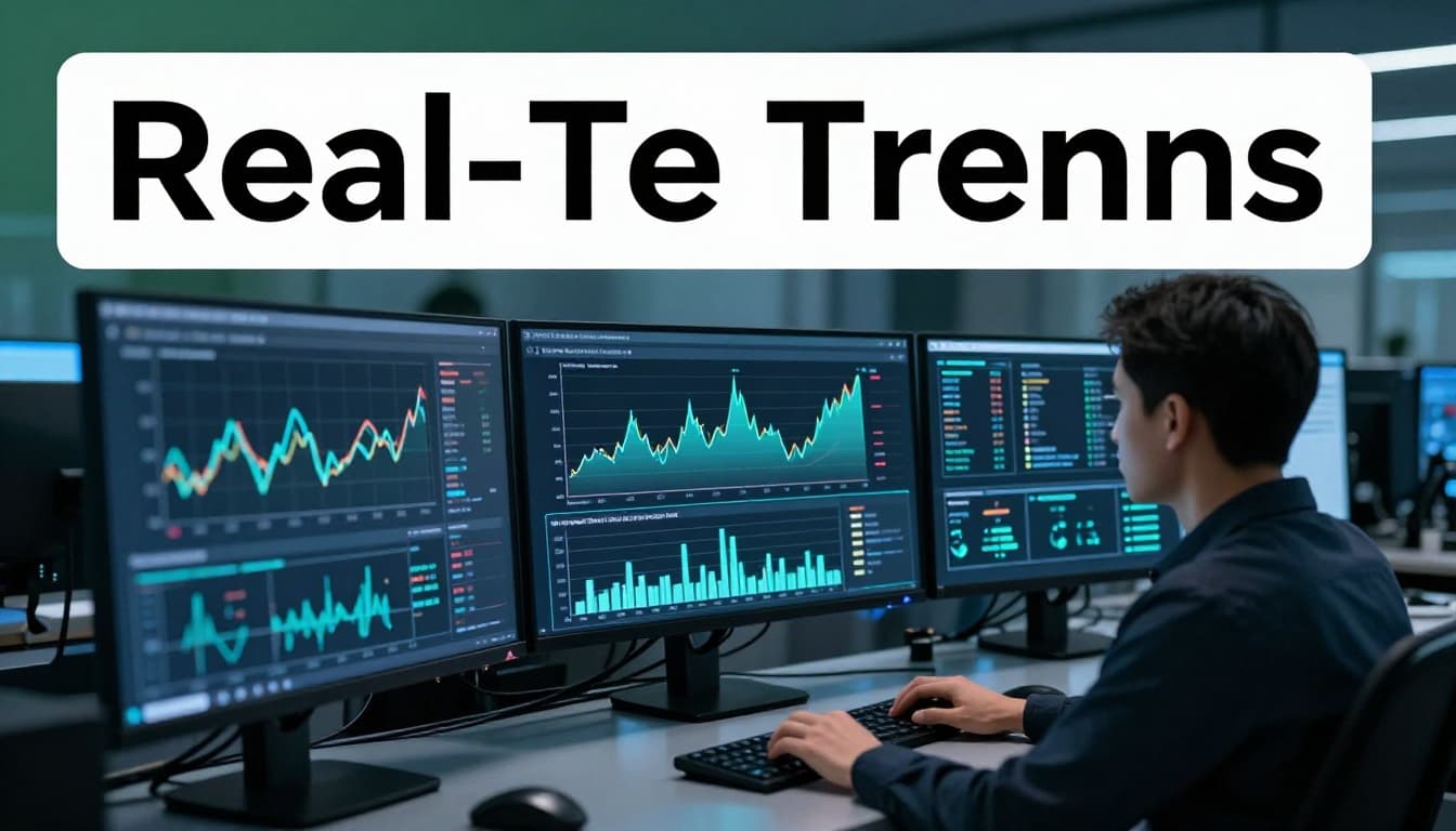
Real-Time Dashboards: Watch Data Change as It Happens
Dashboards update live. Pricing shifts, chains flow. Factory managers see jams and halt losses.
Edge computing speeds it. Data processes on site. No lag.
Great for stock or feedback. Act as it unfolds.
AI Magic: Charts That Explain and Predict Themselves
AI selects bars or lines. It flags drops and forecasts. “Sales dip next month. Adjust now.”
Finance gets risk alerts. No manual hunts.
Tools summarize in words. Insights land fast.
See Energent’s take on AI visuals.
Interactive Charts: Dig Deeper Without Waiting
Click to zoom or filter. Teams self-serve. No report requests.
Drag for custom views. Link sales to news. Full picture emerges.
Top Tools and Real Wins: Charts Powering Big Companies
Power BI leads in 2026. Tableau wows with beauty. Qlik Sense digs deep.
Pick by needs. Microsoft fans love Power BI’s ease and price. Tableau suits pros. Qlik handles big data.
| Tool | Best For | Cost | Ease |
|---|---|---|---|
| Power BI | Microsoft teams, cheap | Lowest | Easiest |
| Tableau | Pretty dashboards | Highest | Medium |
| Qlik Sense | Deep exploration | Medium | Hardest |

Real wins abound. Carta cut data time 80% with Pigment charts. Deeper dives weekly now. See their story here.
Danone slashed planning from weeks to days. Excel chaos gone.
Shopify shops track all via Triple Whale. Quick pricing tweaks boost profits.
Get Results Fast: Best Practices for Chart-Driven Decisions
Right habits make charts shine. Avoid clutter. Go interactive smartly.

Match Charts to Your Question
Bar for compares. Line for trends. Skip pie with many slices; it muddles.
Warehouse picks scatter for links. Clear choice, clear action.
Simplify to Highlight What Matters
Cut extras. Focus one key metric. Bars breathe.
Overload hides truths. Clean wins decisions.
Go Interactive and Real-Time Smartly
Ops needs live. Reviews suit static. Balance saves resources.
Teams explore freely. Insights flow.
Charts deliver 77% better decisions. They spot what spreadsheets miss.
Start small. Grab Power BI or Tableau. Build one chart this week. Test on sales data. Share your win below. Your edge awaits.