Picture your sales team huddled around a pie chart. Each region looks like an equal slice. North brings in twice the revenue of West, but the chart hides that. Decisions go wrong because the graph misleads.
You face messy spreadsheets daily. Numbers blend together. The right graph turns them into clear stories. Anyone spots trends or winners fast. Categorical data groups items like products or cities. Numerical data measures things like prices or heights. Time series tracks changes over months. Distributions reveal spreads in scores or ages.
This guide matches graphs to your data. Bars handle categories best. Lines show time flows. Scatters link numbers. You’ll see examples, pitfalls, and 2026 tools that pick graphs for you. Simple rules make you choose right every time.
Why Bar Charts Rule for Categorical Data
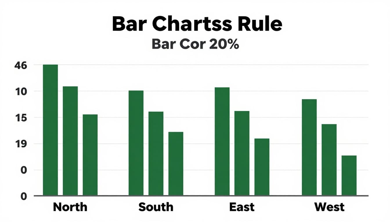
Categorical data sorts into groups or labels. Think sales by region, votes by candidate, or customers by city. Bars compare these groups clearly. Each bar stands for one category. Length shows the value.
Use bars for 2 to 10 groups. They make differences pop. Keep all bars the same width. Sort them tallest to shortest. Readers grasp top performers at a glance.
Label axes with clear titles. Add units like dollars or percentages. Use colors to split subgroups, but pick a simple palette. Go horizontal if category names run long.
For more on bar design tips, check AFFiNE’s bar graph best practices.
Vertical and Horizontal Bars: Pick the Right Orientation
Vertical bars suit short labels and few items. Space them evenly. Start the y-axis at zero. Add data labels right on the bars.
Horizontal bars fit long text. They rank items side by side. Sorting helps here too. Spot leaders without turning your head.
Both orientations avoid distortion. Test on a colleague. Do they read it fast?
Stacked Bars and Pies: Breaking Down Totals
Stacked bars show parts of a whole across groups. Each bar splits into segments. Limit stacks to 4 or 5. Use consistent colors for the same parts.
Pies work for one total with under 6 slices. They show shares like market pieces. But pies fail at comparisons. Small slices vanish. Use a legend, but keep it simple.
For example, brand shares in a pie make sense alone. Compare years? Switch to stacked bars.
Scatter Plots Reveal Links in Numerical Data
Numerical data uses continuous numbers. Heights, prices, test scores fit here. Scatter plots pair two variables. Each point marks one pair. Patterns emerge, like clusters or lines.
Ask if A affects B. Does more study time boost grades? Plot hours versus scores. Dots trend up? Positive link.
Add a trend line for direction. Color points by groups, like age. Size them for a third variable. Bubbles grow with population, say.
Label outliers. They tell big stories. Use log scales for skewed data.
See CleanChart’s guide on scatter plots for correlations for examples.

Bubble Charts and Trend Lines for Extra Insights
Bubble charts add a third measure via size. Population bubbles show city impacts.
Trend lines smooth the noise. Upward slope means growth together. Flat? No link. Hover details in interactive versions.
Keep points under 100. Filter or zoom to avoid clutter.
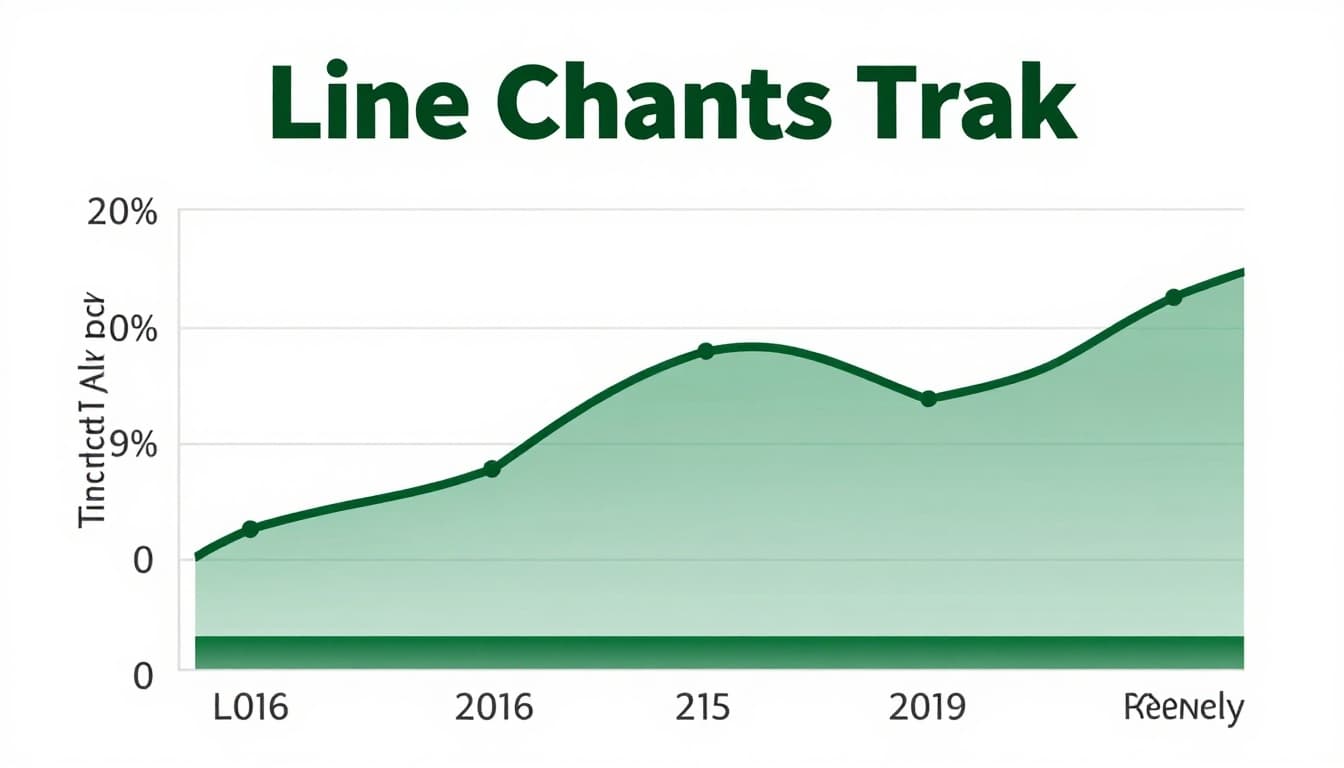
Line Charts Track Time Series Data Perfectly
Time series data shifts over time. Stock prices, monthly sales, daily temperatures count. Lines connect points in order. Trends show clear.
Plot time on the x-axis. Even intervals matter. Multiple lines compare series. Shade forecast bands ahead.
Start x-axis at a logical point, not always zero. Breaks mark missing data.
Area charts fill below the line. They stress totals. Stack areas for parts adding up.
Check Observable’s comparison of bars versus lines for time data.
Area Charts to Emphasize Volume Over Time
Areas suit cumulative flows. Stacked ones break volumes into parts. Colors stay consistent.
Skip them for exact reads. Lines work better there.
Histograms and Box Plots Show Data Spreads
Distributions reveal clusters and spreads. Ages in a town, exam scores across classes. Histograms group numbers into bins. Shape tells if data bells out or skews.
Use 5 to 20 even bins. Too few hides detail. Too many confuses.
Box plots sum up with median, quartiles, and outliers. Whiskers mark ranges. Compare groups side by side.
Learn from Number Analytics on histograms versus box plots.

Box Plots for Group Comparisons and Outliers
Boxes shine for skewed data. Outliers dot outside. Compare 3 to 5 groups easy.
Violins add density if needed. Basics suffice most times.
Skip These Graphing Mistakes Every Time
Wrong graph kills clarity. Pies for time data? No. Bars not at zero? Tricks eyes.
Clutter hides points. Ditch 3D, extra colors, thick grids.
Miss labels, units, sources? Readers guess. Small pie slices disappear.
Fixes work simple. Match graph to data type. Start axes at zero. Test on others.
High contrast aids all viewers. Add alt text.
Avoid issues with tips from Bix-Tech on visualization pitfalls.
2026 Trends and Tools to Choose Graphs Automatically
AI now scans your data. It picks bars for categories or lines for time. No guesswork.
Interactive dashboards zoom and hover. Real-time updates fit sales floors.
Top picks include Tableau’s Agent for chat-built charts. Power BI’s Copilot crafts from words. Qlik Sense links patterns auto.
Free options like Google Charts start quick. Trends push less clutter, more stories. Mobile views and forecasts rule.
Try Energent.ai’s report on AI graph tools.

Match your graph to the data type, and messages land strong. Bars for groups, lines for time, scatters for links, boxes for spreads. Practice builds skill. Tools make it faster.
Grab Tableau or Power BI today. Test a messy sheet. Share your graph glow-up in comments. What data trips you up most?