One graph can flip your view of a major event. Think of an election night bar chart that shows a surprise win, or a climate heatmap revealing rising risks in your area. These visuals cut through raw numbers fast.
Graphs matter in news because they make complex data simple and memorable. People grasp a rising line for stock crashes quicker than paragraphs of stats. In March 2026, outlets like the NYT and BBC rely on them more than ever for trust and shares.
This post breaks down popular graph types, their engagement power, standout examples from top outlets, 2026 trends plus pitfalls, and a peek at what’s next. Ever wondered why some news graphs go viral while others flop? Let’s explore.
Popular Graph Types Powering Today’s News Stories
News teams pick graph types that match the story’s beat. Bar charts compare votes in elections. Line charts track trends like virus cases over months. Each type fits because it highlights key facts without overwhelming readers.
In 2026, data shows bar charts lead for quick polls, while interactive ones dominate live events. BBC often pairs maps with lines for global stories. The Guardian mixes icons into timelines for pandemics. These choices boost clarity and clicks.

Bar Charts: Quick Comparisons That Hit Hard
Bar charts shine for side-by-side looks at sizes. They show poll results by party or sales by region in seconds. Readers spot winners fast because heights tell the tale.
Take election coverage. A bar graph stacks votes for Democrats versus Republicans. Colors separate parties clearly. Benefits include easy scans on mobile and strong impact for headlines. No wonder they appear in 40% of news visuals this year.
Yet, keep bars simple. Too many confuse. News pros add labels for trust.
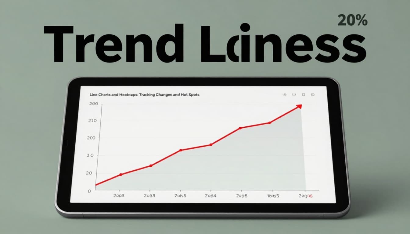
Line Charts and Heatmaps: Tracking Changes and Hot Spots
Line charts plot changes over time. They connect dots for temperature rises or stock dips. In 2026, AI extends lines to predict futures, like next quarter’s GDP.
Heatmaps color-code risks. Red zones flag climate floods or election battlegrounds. CNN uses them for war zones because intensity pops visually.
Both types build tension. Lines show “how bad it got.” Heatmaps scream “where it’s worst.” For example, a BBC line chart tracked Iran conflict oil spikes, making global effects clear.
Interactive Dashboards and Infographics: Hands-On Storytelling
Dashboards let users filter data. Click age groups for vote splits or zoom crime maps. They turn passive reading into exploration.
Infographics blend charts with icons for timelines. NASA’s asteroid trackers, shared by news, mix paths with risk bars. Perfect for pandemics because layers reveal phases step by step.
These boost time on page. Readers stay longer when they control the view.

Why Graphs Make News More Engaging and Shareable
Graphs simplify chaos. Big datasets shrink to one image that sticks. They guide eyes to peaks and valleys, unlike dense text.
Animations add drama. A line climbs as voiceover explains recession causes. This builds emotion and recall. Social shares jump 3x with visuals.
In 2026, AI sharpens focus. It suggests “what if” paths, like policy impacts on jobs. Readers share because they feel smart exploring.
Turning Numbers into Stories Readers Love
Animations breathe life into stats. Bars rise with sound for budget cuts. This hooks emotions better than words alone.
Simplification wins trust. A heatmap boils 10,000 data points to colors. Readers get the gist fast, then dive deeper.
Interactive Magic: Let Readers Play with Data
Sliders change views on the fly. Drag to see UK votes by age. Filters hide noise.
Conversational search asks “show Midwest trends.” Results pop instantly. This personalization keeps users hooked.
Standout Graph Examples from NYT, BBC, CNN, and Guardian
Top outlets nail graphs with real data. They mix interactivity and predictions for virality.
NYT’s climate dashboards forecast sea rises with AI lines. Users tweak scenarios for cities. Shares soared during flood season.
BBC election heatmaps updated live. Colors shifted as votes rolled in. Viewers checked obsessively.
CNN animated globes for pandemic rates. Spinning views showed hot spots by vaccine status. Simple yet gripping.
Guardian’s Iran war cost charts broke down $12.7 billion spends by day six. Bars for bombs versus aid made waste clear. Similarly, their oil price visuals mapped Hormuz impacts.
BBC’s Iran war effects charts linked petrol hikes to strikes. Six bars showed daily life hits.
CNN’s Iran attack maps tracked retaliation paths. Heatmaps lit up Gulf risks.
These examples engage because they predict and personalize. Virality follows.
NYT and CNN: Climate and Pandemic Visuals That Wow
NYT lets users project floods. AI lines extend trends. CNN globes spun death rates by region. Both drove debates.
BBC and Guardian: Elections and Economics in 3D
BBC heatmaps pulsed live votes. Guardian 3D scenarios tested economic “ifs.” Readers tested paths themselves.
2026 Trends and Pitfalls in News Graphs
AI auto-builds charts now. It spots patterns in raw feeds for instant stories. Real-time updates skip refreshes via edge computing.
Immersive VR overlays graphs on events. No-code tools let reporters drag-drop pros. Yet pitfalls lurk.
Hot Trends: AI, Real-Time, and Immersive Visuals
AI picks best charts and adds predictions. Dashboards personalize by user role. AR scores sports plays live.
Collaborative edits speed teams. These make news faster and deeper.
Common Traps: Spotting Misleading Graphs Fast
Truncated axes exaggerate small shifts. Start y-axis at zero always.
Cherry-pick hides full trends. Check sources. Overload jams details; simplify.
AI biases slip in. Verify labels and baselines. Outlets warn on “AI slop.”
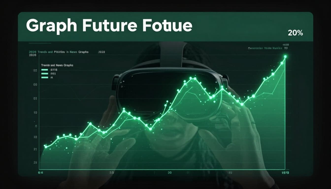
The Future of Graphs in News and Media
AI agents will craft custom visuals on demand. Ask for hyper-local polls; get tailored maps.
AR phones overlay graphs on live events, like crowd flows at protests. Trust rises with verified sources beating deepfakes.
Engagement soars as graphs predict personally. News rebuilds faith through clear, interactive truth.
Graphs transform raw data into stories that stick. They simplify, engage, and predict in ways text can’t match.
Next time you scroll news, spot the graphs. Check axes and sources to avoid tricks.
Share your favorite graph example in comments. Subscribe for more on data viz trends in media.