Ever stared at a stack of bank statements, feeling buried under numbers? Sarah did just that last month. She pored over rows of transactions until a simple pie chart revealed her coffee runs ate 15% of her budget. That one visual shifted everything. She cut back and saved $200 right away.
Data visualization turns raw numbers into charts, graphs, or maps that anyone can grasp fast. It spots patterns hidden in spreadsheets or app logs. These skills help you handle money, track health, follow news, and shop smarter. No need for math degrees. In 2026, AI tools make it point-and-click simple, no coding required.
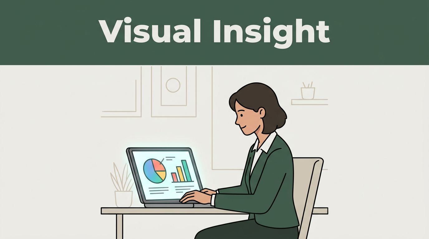
You will see real examples here, plus free apps to try today. Why wait to make your data work for you?
Unlock Smarter Choices by Spotting Patterns Fast
Raw numbers overwhelm. Lists of expenses or steps blur together. Charts cut through that noise. You spot trends in seconds, like bills climbing or energy dropping. This leads to quicker fixes.
People save time because visuals highlight issues first. Mistakes drop too. You avoid guessing and act on facts. For example, a line graph shows if your grocery costs spike on weekends. Share it via text, and family gets on board fast.
AI steps in now. It reads your data and builds charts automatically. Real-time updates keep everything current, like stock prices or daily steps. Trends show this boosts daily decisions across apps.
Benefits stack up. You build better habits. Waste shrinks. Confidence grows with clear proof.
Catch Spending Surges Before They Hurt Your Wallet
Finance apps shine here. Upload statements, and live pie charts break down where cash flows. Heatmaps flag high-risk spending, like subscriptions piling up.
AI predicts shortfalls. It asks your data questions and forecasts if vacation savings hit the mark. Tools like Looker Studio connect to bank apps for instant views.
One user tracked habits monthly. The chart showed dining out doubled costs. She switched to home meals and pocketed hundreds. Check best money management apps for cash flow reporting to see top picks.
You dodge overspend. Big buys become planned, not panicked. Savings grow steady.
Notice Health Clues Your Eyes Might Miss
Fitness trackers log steps, sleep, and heart rates. Graphs reveal dips you ignore in tables. A spike on stress days stands out clear.
AI connects dots. It flags why recovery lags after late nights. Apps pull from wearables for one dashboard view.
Sarah checked her phone graph. Energy crashed midweek because sleep averaged five hours. She added naps, felt sharper in days. Popular apps use these visuals; see best fitness and workout apps for options.
Fix issues early. Habits stick because proof motivates. Health improves without guesswork.
Decode News and Shopping Like an Insider
News floods in daily. Static text confuses. Interactive maps let you zoom into weather patterns or election shifts. Stories unfold as you explore.
Shopping apps match this. They show price drops live or review trends in globes. You grasp events fast and grab deals sharp.
These visuals build context. World changes make sense. Savings add up from smart buys.
| Area | Example Visual | Everyday Help |
|---|---|---|
| News | Election maps | Track local races by county |
| Weather | Live heatmaps | Spot storm paths early |
| Shopping | Price trend lines | Find Black Friday lows |
This setup speeds insight. No digging required.
Turn Headlines into Stories You Actually Get
Headlines tease. Maps deliver details. Click NASA’s space feeds for orbit paths. Environmental layers show flood risks by zip code.
Election coverage uses county maps. Hover reveals turnout shifts. NBC offers live primary results with interactive views.
You cut confusion. Big shifts register quick. Decisions, like voting or prep, follow facts.
Hunt Deals by Watching Sales Data Live
E-commerce tracks your buys. Charts plot habit peaks, like gadget splurges. Alerts ping fraud or deep discounts.
Real-time globes spin sales data. Black Friday heat spots best zones. Apps predict drops based on past years.
One shopper watched phone prices. The line dipped 20% mid-month. She timed the buy perfectly. Savings compound over time.
Grab 2026 Tools That Let Anyone Create Pro Charts
2026 brings no-code power. Drag data, ask questions, watch charts build. Interactive ones zoom and filter on tap. AI answers “show trends” instantly.
Real-time dashboards refresh like phone notifications. Animations guide stories through data. Phones and banks embed them now.
Start simple. Pick an app. Upload CSV or connect accounts. Type queries. Edit as needed.
Top picks fit daily use:
Julius chats data for budgets.
Looker Studio links Google sheets free.
Polymer auto-builds from spreadsheets.
Zoho spots trends quick.
Flourish crafts news maps fun.
These handle personal files easy. Free tiers cover most needs.
AI Apps That Build Charts from Your Questions
Type “why did spending rise?” AI delivers pies and predictions. Tableau GPT or ThoughtSpot Sage handle health logs too.
For shopping, ask deal patterns. Charts pop with forecasts. No setup hassle.
Users love natural talk. Insights flow fast.
Build Dashboards Without Touching Code
Drag columns to graphs. Ajelix refreshes stock views live. Visme animates news timelines.
Personal budgets update hourly. Steps sync real-time. Build once, watch evolve.
Future-proofs skills as tools spread.
Data visualization changes routines. Charts tame money leaks, health slips, news blur, and deal hunts. You decide sharper every day.
Grab Looker Studio today. Load your bank CSV. See patterns emerge.
By 2030, these skills match texting ease. Share your first chart win below. What surprised you most?