Picture this. You’re in a team meeting. Your boss pulls up a chart showing sales data. Bars stand side by side with gaps between them. But the numbers represent delivery times in hours. Everyone nods, yet the chart hides the real flow of those times. Confusion spreads. Questions fly. That mix-up cost the team hours.
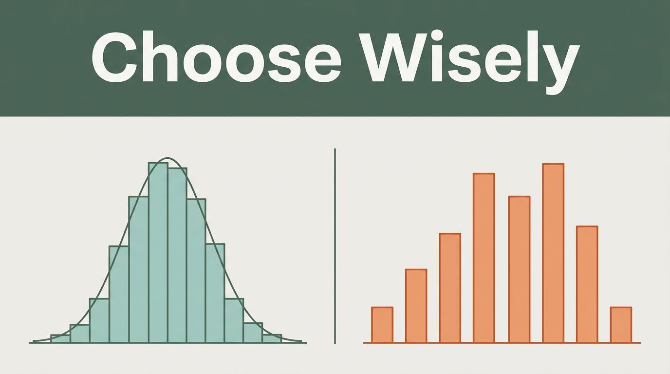
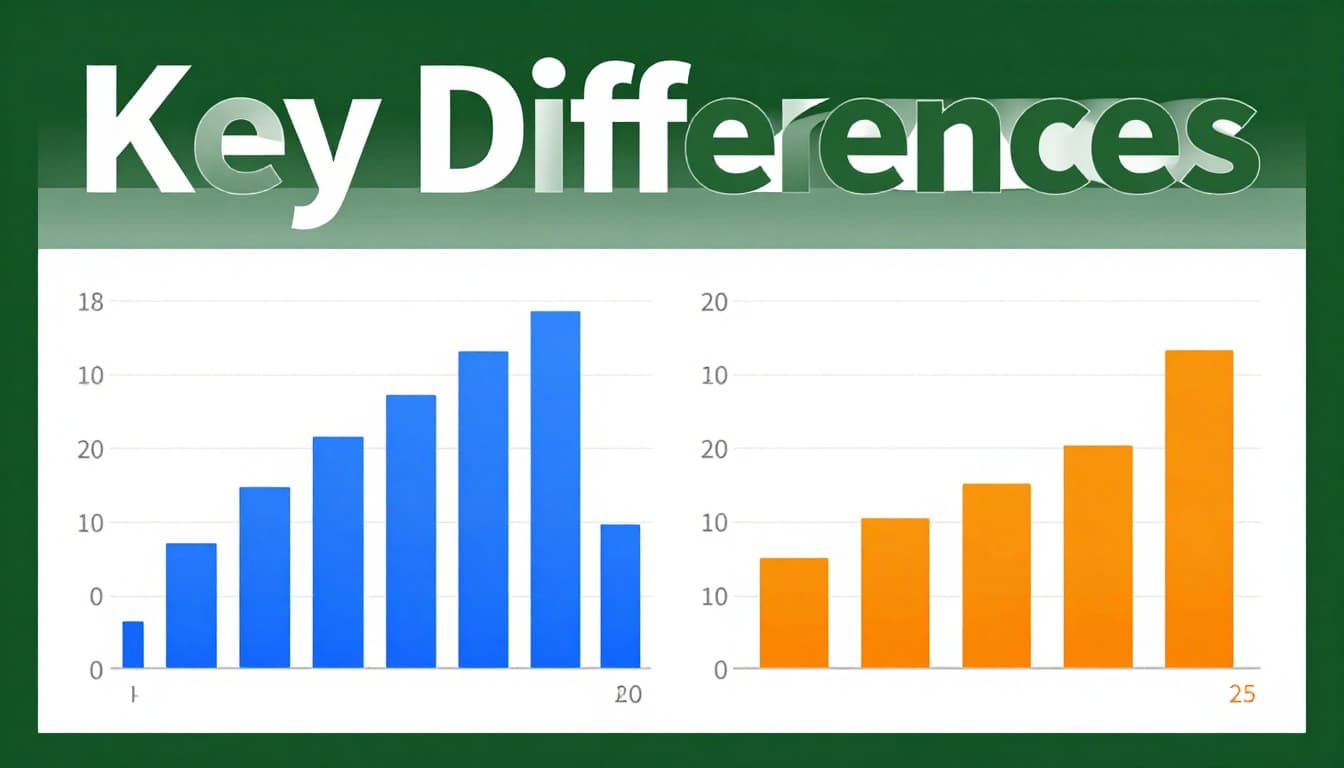
Histograms and bar charts both rely on bars. However, they handle different data types. Histograms track continuous data, such as ages or test scores. They reveal how values spread out. Bar charts compare separate categories, like sales by fruit type. Choose wrong, and you mislead your audience.
The key lies in data nature. Use a histogram for continuous values to spot clusters, gaps, or peaks. Bar charts work best for discrete groups. This guide breaks it down. You’ll learn differences, scenarios, examples, and tips. So, when should you grab a histogram? Let’s find out.
Spot the Key Differences Before You Pick the Wrong Chart
Many folks grab the wrong chart. They see bars and think “close enough.” That error distorts insights. Histograms suit continuous data. Bar charts fit categories. Spot these contrasts first.
Here’s a quick comparison using test score data for 100 students and fruit sales by type.
| Feature | Histogram (Test Scores) | Bar Chart (Fruit Sales) |
|---|---|---|
| Data Type | Continuous (e.g., 65, 72.5) | Categorical (e.g., apples) |
| Bar Spacing | Touching (shows flow) | Gaps (shows separation) |
| X-Axis | Bins (60-70, 71-80) | Labels (apples, bananas) |
| Y-Axis | Frequency (count per bin) | Values (total sold) |
| Bar Order | Fixed (low to high) | Flexible (sort by size) |
This table highlights why choices matter. Wrong spacing fakes divisions in smooth data. For more on these basics, check ConceptViz’s guide to bar chart vs histogram differences.
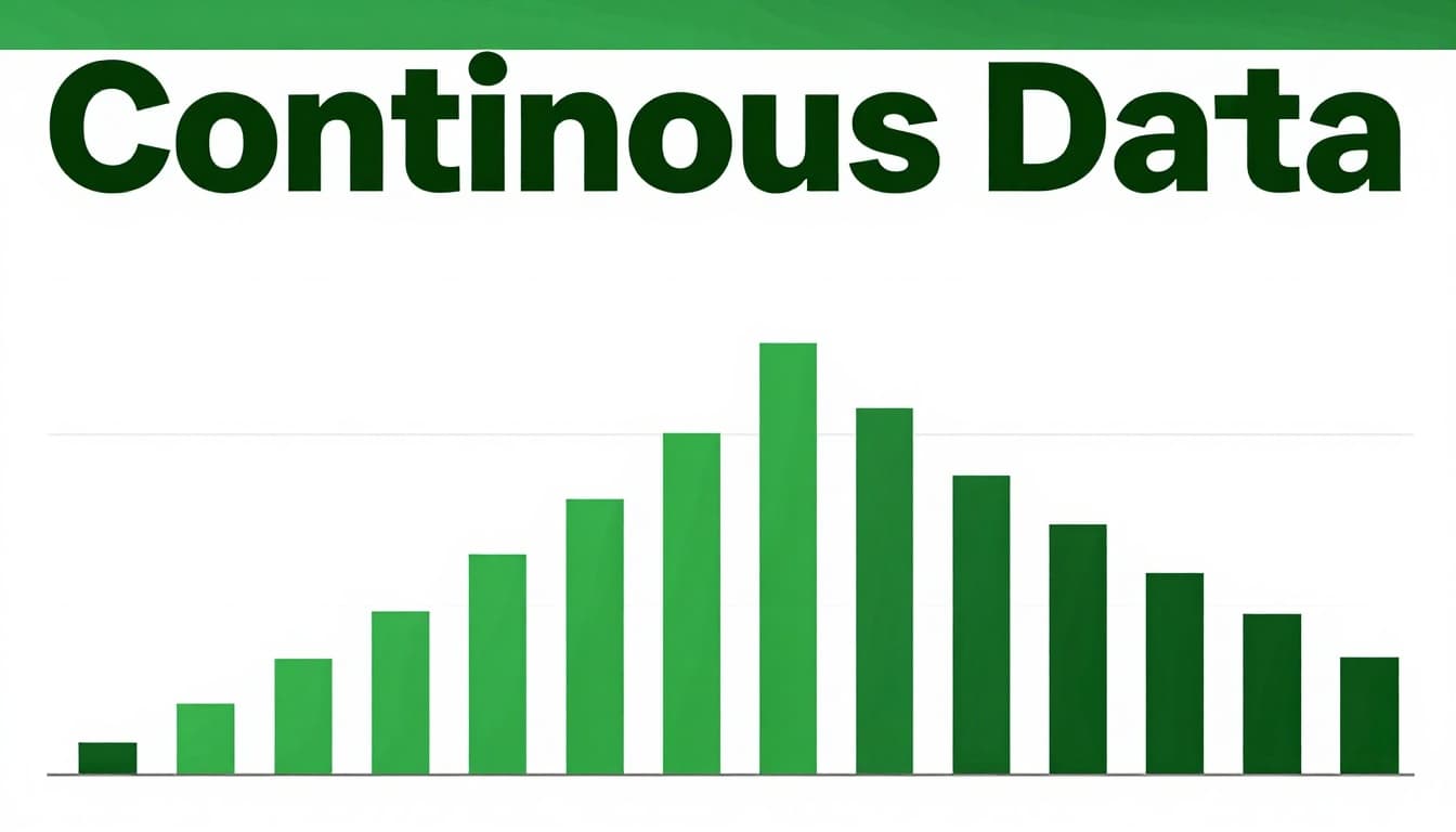
Continuous Data Needs Touching Bars
Continuous data flows without breaks. Think heights or times. Histograms use touching bars for this. Gaps would suggest false splits.
Take ages in a school. Bin them as 0-10, 11-20 years. Bars touch to show smooth ranges. This reveals clusters, like most kids at 14-15. A bar chart adds gaps. It implies ages don’t connect. Viewers miss the natural spread.
In 2026 tools, auto-binning helps here. Software suggests ranges based on data spread.
Categories Demand Gaps for Clean Comparisons
Categories stay separate. Cities, colors, brands. Bar charts shine with gaps between bars.
Sales by city? Label x-axis “New York,” “Chicago.” Gaps clarify no overlap. A histogram forces bins on names. That creates nonsense ranges. Comparisons get muddy.
Gaps prevent mix-ups. They signal distinct groups.
Axes and Order Make or Break Clarity
X-axis differs too. Histograms bin numbers: 0-10, 11-20. Bar charts use names: red, blue.
Y-axis shows frequency in histograms. Counts per bin. Bar charts plot totals or averages.
Order stays fixed in histograms. Low to high bins. Rearrange, and you break the scale. Bar charts let you sort descending for quick wins.
Mix these, and clarity vanishes. Follow 2026 best practices from Syncfusion’s bar graph vs histogram breakdown. Right axes prevent wrong stories.
Choose Histograms for These Continuous Data Scenarios
Continuous data calls for histograms. They uncover shapes like bell curves or skews. Bar charts chop it into fake categories. Skip that trap.
Use histograms for single-variable distributions. Spot normal spreads, peaks, or tails. Test scores work well. Bin as 0-60, 61-80. Most cluster at 70-80? That insight guides teaching.
Daily rainfall fits too. Bins show dry spells or flood risks. Bar charts hide those flows.
Aim for 5-20 bins. Too few smooths details. Too many adds noise. Test options in tools.
Ages and Populations in Real Life
School ages scream histogram. Peak at 14-15 years shows enrollment bulges. Bar charts slice it rigidly. Patterns vanish.
Population data by age range follows suit. Bins reveal youth booms or aging trends. Stakeholders see risks clearly.
Scores, Weights, and Times
Test scores spread wide. Histograms flag average clusters or failures. Weights in a gym? Peaks at fitness goals.
Times, like run durations, show paces. Most runners at 30-40 minutes? Adjust training.
Bar charts tempt here. They fail by adding gaps. Insights stay buried.
Real-World Examples Where Histograms Win Big
See histograms shine in action. Compare side-by-side.
Rainfall amounts over a month. Histogram bins 0-1 inch, 1-2. Touching bars show most days dry, few heavy. A bar chart gaps them. It suggests separate events, not flow.
Fruit sales? Bar chart wins. Apples: 100 units. Bananas: 150. Gaps highlight top seller. Histogram bins fruits? Chaos.
Car sales by brand use bars. Incomes? Histogram bins $0-50k, $50k-100k. Touches reveal wealth gaps.
For deeper contrasts, see Storytelling with Charts on key differences.
Sales Data: Bars for Categories
Apples versus bananas. Gaps make the leader pop. Totals compare clean.
Distribution Data: Histograms for Spread
Incomes or votes by range. Touching bars map reality. Clusters emerge.
Best Practices and Pitfalls to Nail Your Visuals
Nail charts with smart habits. Start y-axis at zero. Limit colors. Sort bar charts descending.
Histograms need wise bins. 2026 trends push auto-tools. They cut guesswork.
Common pitfalls kill trust. Gaps in histograms fake breaks. Categories in continuous data chop flows. Skip 3D effects; they skew views.
Label axes clear. Add units. Titles say “Distribution of Ages.”
Tools like Excel 2026 or Tableau suggest types now. Use them.
Pick bins right, or hide truth. Test 5-20 for balance.
Details from Black Label’s histogram vs bar chart choice guide.
For bin math, try the Scott Rule for histogram widths.
Pick Smart Bin Sizes and Avoid Tricks
Too few bins? Flat line. Too many? Jagged mess. Start at 5-20. Adjust by eye.
Skip dual axes or logs unless needed. Keep simple.
Label Everything and Start at Zero
Axes need names: “Age (years).” Y at zero avoids tricks.
Data labels on big bars help scans.
Histograms for continuous data. Bar charts for categories. That rule sticks.
Review your last chart. Remake it right. You’ll spot hidden stories.
AI tools in 2026 auto-pick types. They boost speed. Gain confidence. Tell data tales that land.
What chart mix-up tripped you? Share below.
(Word count: 1487)