
Imagine your coffee shop’s daily sales climbing steadily on a line chart as winter hits. Customers crave hot drinks, and the numbers prove it. You spot the trend right away: a clear upward pattern over weeks.
Trends show patterns in data, like rises, falls, or steady holds over time. They guide smart choices in business, fitness tracking, or stock picks. This guide walks you through spotting them without complex math.
You’ll prep data, pick graphs, name patterns, use tools, and avoid mistakes. Ready to see trends others miss?
Start with Solid Data: Gather and Clean Before Graphing
Bad data hides real trends. Picture sales figures with typos or gaps; your graph twists into nonsense. Clean data first, so patterns emerge clear.
Collect accurate info at set times, like weekly website visits. Pick reliable sources, such as sales logs or fitness apps. Consistent timing builds trustworthy graphs.

Collect Data at Regular Times for Reliable Patterns
Set fixed intervals, daily or monthly. Weekly tracking suits most trends. Irregular dates distort lines; smooth data shows true flow.
For example, log website traffic every Monday. Use spreadsheets or apps. This step ensures your graph reflects reality.
Sources matter too. Pull from one place, like Google Analytics. Multiple spots invite errors. Regular collection spots trends early.
Spot and Fix Data Glitches to Reveal True Trends
Check for missing points first. Fill gaps with averages from nearby days. Typos, like “1000” sales as “10OO,” need correction.
Outliers pop up, such as a hat sale glitch spiking revenue. Delete or adjust them. Duplicates double counts; remove extras.
For details on fixes, see Tableau’s data cleaning guide. Simple steps prevent false trends later.
Visualize Your Data: Choose Graphs That Highlight Trends
Graphs beat tables for quick insights. Lines connect points over time, revealing direction fast. Tables bury patterns in rows.
Pick line graphs for changes, like monthly revenue. Scan left to right for overall slope. Add average lines for context.
Zoom out to ignore small dips. Tiny wiggles fade; big moves stand out. This view clarifies the story.
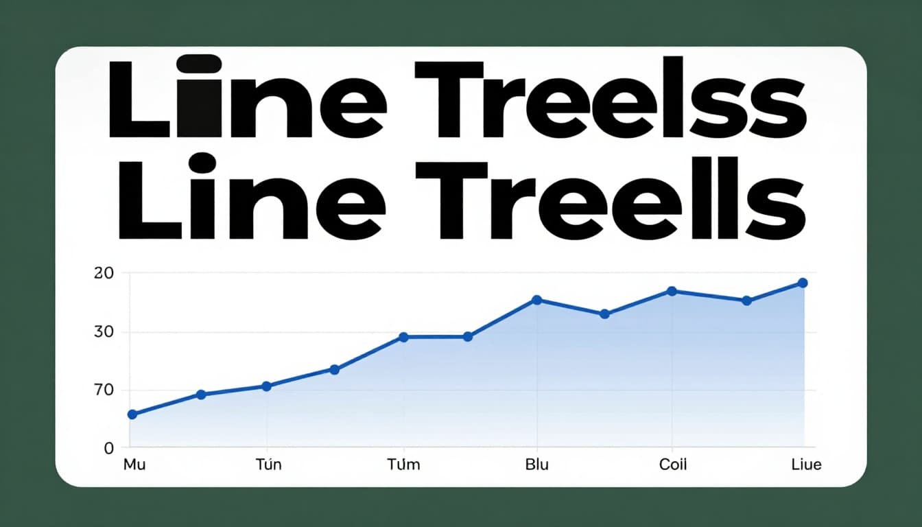
Why Line Graphs Are Your Best Friend for Trends
Lines shine for time data. Bars work for categories, but lines link points to show motion. Temperature over days flows smooth on lines.
Compare to bars; stiff chunks hide flow. Lines curve or slope naturally. For more, check Domo’s line chart overview.
Start simple. Plot dates on x-axis, values on y. Trends jump out.
Know These Trend Types: Up, Down, Flat, or Cycling
Data forms four main patterns. Upward lines signal growth. Downward drops warn of trouble. Flat holds steady; cycles repeat.
Steep slopes mean fast change. Gentle ones build slow. Name them quick to act.

Catch Rising Trends That Signal Growth Opportunities
Lines climb rightward. Measure slope by eye; steeper means quicker rise. App downloads doubling yearly? That’s growth.
Check over months. Consistent upticks predict more. Act now, like stocking extra coffee.
Detect Falling Trends Before They Hurt
Dropping lines alert you. Sudden plunges differ from slow fades. Podcast listens dipping? Dig into causes.
Slow declines build over time. Spot them early to pivot.
Spot Steady Flatlines for Stability Checks
Horizontal lines mean balance. Small ups and downs average out. Utility bills holding? Budget stays safe.
Ignore minor noise. Stability lets you focus elsewhere.
Uncover Repeating Cycles Like Seasonal Swings
Waves repeat, like ice cream peaks in summer. Link to calendars. Holiday sales cycle yearly.
Average cycles smooth the path underneath. See CleanChart’s time series guide for visuals.
Boost Accuracy with Trend Tools and Smart Analysis
Tools confirm what eyes see. Trendlines cut through points. Moving averages smooth bumps.
Free options abound in 2026, like Google Looker Studio or Tableau Public. Excel works too. Pick by data size.

Draw Simple Trendlines for Instant Direction
Select data in Excel. Insert scatter plot. Right-click points, add trendline.
It slices through highs and lows. Straight paths fit linear trends. See Coefficient’s Excel trend tutorial.
Smooth Bumps with Moving Averages
Average last few points, say seven days. New line hugs the underlying path. Sales wiggles flatten.
Try in Sheets. Shorter windows track fast; longer smooth more. Statsig explains rolling averages well.
Use Regression for Predictions and Fits
Fits best line with math. Equation forecasts ahead. Excel displays R-squared for fit quality.
Combine with averages. Predict next month’s sales confidently.
Apply Pro Tips and Dodge Traps for Flawless Trend Hunting
Keep it basic at first. Zoom for the big view. Compare to past goals.
Segment data, like by region. Context explains why trends happen.
Quick Wins: Tips to Make Trend Spotting Effortless
Start with clean data always. Use line graphs first. Check multiple time frames.
Break big sets into groups. Compare to benchmarks. Practice boosts speed.
Steer Clear of These Sneaky Analysis Errors
Noise fools as trends. Dirty data lies. Wrong tools mislead.
Skip context, miss reasons. History hints, doesn’t guarantee. Test on real sets.
Spotting trends sharpens decisions. Clean data, line graphs, named patterns, and tools like trendlines make it simple. Grab your spreadsheet now. Plot a line and share what you find in comments.
Try Google Looker Studio for free dashboards. What trend will you uncover next? Graphs turn numbers into action.