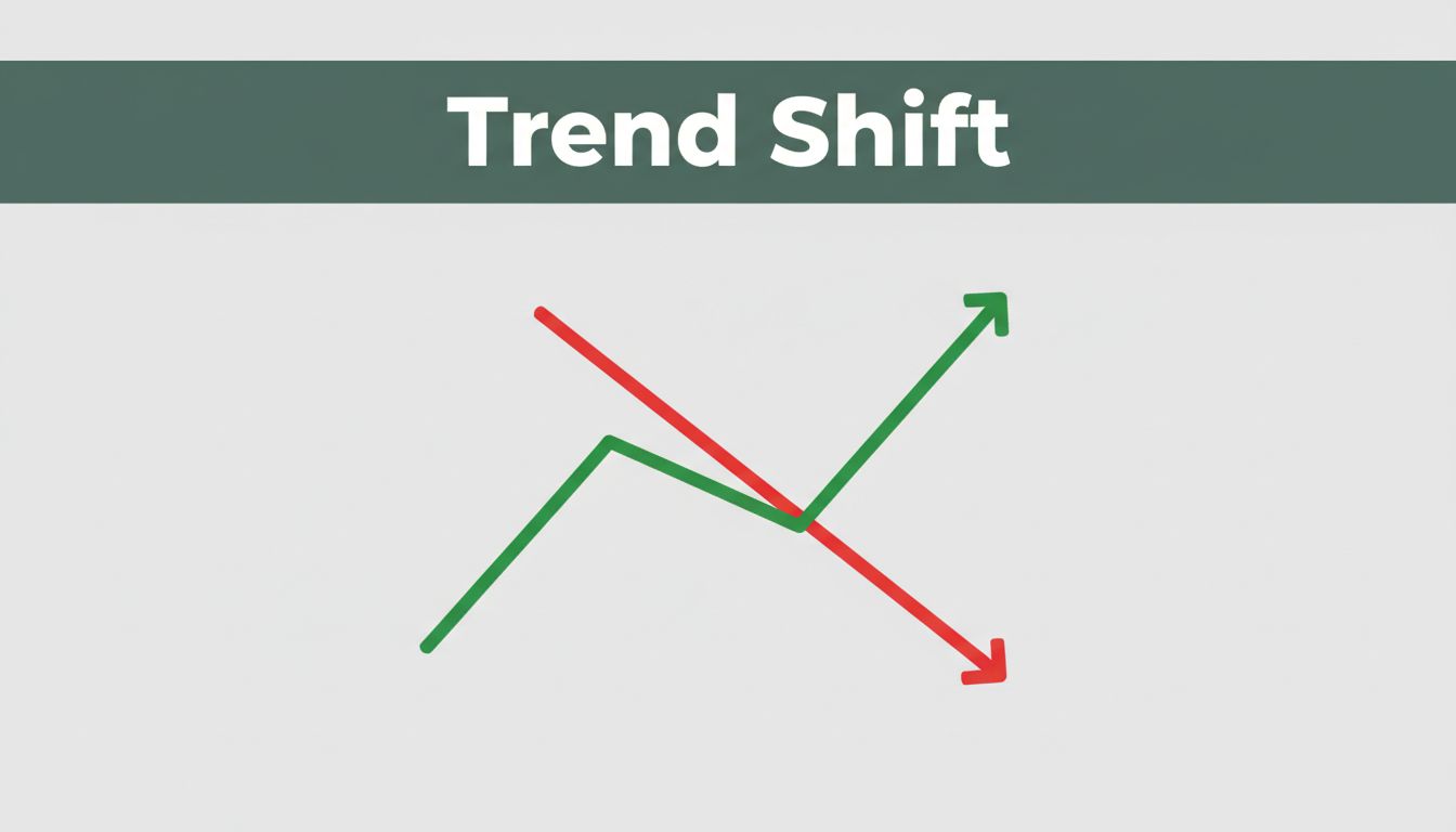
Picture this. You’re watching your favorite team’s score climb during a big game, or your portfolio dips as stocks tumble on the news. Graphs turn those raw numbers into quick visuals of change.
An increase in a graph shows growth. Values rise from left to right or bar to bar. A decrease signals a drop. Things shrink or fall. You see this everywhere, from sales reports to weather apps.
These patterns guide smart choices. Businesses spot sales booms. Doctors track health improvements. News readers catch economic shifts. Yet many miss the details. This post breaks it down. You’ll learn basics, line graphs for time trends, bars and areas for comparisons, real examples, pitfalls, and 2026 tools. Next time you see a chart, you’ll read it like a pro.
The Basic Signals: What Rising or Falling Lines and Bars Tell You
Graphs boil data down to motion. An increase means values go up. Sales jump from 10 units to 20. That’s growth you can act on. A decrease shows the opposite. Website visits fall from 100 to 50. Time to fix what’s wrong.
Flat lines mean stability. No big shifts. Values hold steady. Trends matter most, though. Upward moves signal positive change, like rising profits. Downward ones warn of trouble, such as declining attendance.
Spot these fast for quick wins. Managers celebrate uptrends. They dig into downturns. Here’s a simple table to compare:
| Signal | What It Shows | Example | Action Tip |
|---|---|---|---|
| Increase | Growth or rise | Sales: 10 to 20 units | Scale up efforts |
| Decrease | Decline or shrink | Visits: 100 to 50 | Investigate causes |
| Flat | No change | Temp: 70F steady | Maintain current plan |
This setup works across graph types. For deeper math on intervals where functions rise or fall, check Lumen Learning’s guide on graph changes. Now let’s zoom into lines, which shine for time-based shifts.
Line Graphs: Spotting Trends Over Time
Line graphs connect points with lines. They track continuous data over time, like months or years. Perfect for trends, not categories.
An increase appears as an upward slope. Stock prices climb from $10 to $20. Spring temperatures rise from 50F to 80F. You predict more warmth ahead.
A decrease slopes down. COVID cases dropped after vaccines. Holiday website visits dip. These lines reveal patterns at a glance.
Jagged lines suit smooth changes. Avoid them for discrete data, like daily counts. Sketch one yourself. Mark time on the bottom, values up top. Connect dots.

When Lines Climb: Examples of Growth
Steady rises mean improvement. Daily temperatures edge up through spring. You learn to expect warmer days soon.
Peaks cap strong upward runs. Businesses see revenue climb, then top out. Plan for the next push. These clues help forecast success.
When Lines Dip: Signs of Decline
Downward slopes signal loss. Unemployment falls? That’s good news. Rising cases mean caution.
Yet dips often hint at recovery. Rainy days drop from 10 to 4. Sunny weather returns. Spot the bottom to time comebacks right.
Bar and Area Graphs: Comparing Groups and Totals
Bars stand alone for categories. No lines between them. Taller bars show increases. Sales in 2025 top 2024’s. Votes rise from 100 to 150.
Shorter bars mean decreases. Rainy days shrink from 10 to 4. Compare heights side by side.
Area graphs shade regions for totals or parts. Wider areas signal growth. Revenue expands as product shares grow. Stacked areas show how pieces add up.
Shrinking areas point to loss. Market share contracts. Use stacks to see which parts hurt most.
Lines track time. Bars and areas handle groups. For bar chart basics with category examples, see GraphMake’s complete guide.
| Graph Type | Best For | Increase Example | Decrease Example |
|---|---|---|---|
| Bar | Category comparisons | 2025 sales > 2024 | Rainy days 10 to 4 |
| Area | Totals and parts | Revenue area widens | Share shrinks |
Bars Rising Higher Than Others
Direct height checks reveal winners. Apples outsell oranges. The taller bar wins. Dig into why for strategies.
Groups let you rank fast. Team A scores more than B. Adjust lineups accordingly.
Shaded Areas Expanding or Shrinking
Totals grow with wider shades. Stacked phones dominate revenue. See the biggest slice first.
Drops hit hard in stacks. Downloads fall across apps. Pinpoint weak spots to fix.
Real-Life Examples That Make Graph Reading Click
Graphs pop in daily news. Line charts track spring temperatures rising. Warmer days build steadily.
COVID cases fell post-vaccines. Downward lines eased worries. Businesses reopened.
Bars compare votes. Team A gains in February over January. Fans cheer the uptick.
Rainy days drop from 10 to 4. Planners schedule outdoor events.

Areas show revenue growth. Phones stack highest. Market share shrinks elsewhere.
In March 2026 US economy news, jobs added 130,000 early year but dipped later. Inflation climbed to 3.5%. Lines and bars make these trends clear. Pros decide investments or policy from them.
Population grows upward. Good unemployment drops signal strength.
Sneaky Pitfalls to Dodge in Graph Trends
Tricky y-axes start high, not zero. Small rises look huge. From 95 to 105 seems dramatic.
Too many lines clutter views. Pick three max. Focus stays sharp.
Connect lines on categories? Fake smoothness. Use bars instead.

Stacked areas distort middles. Tops and bottoms compare easy. Centers mislead.
Rely on colors alone? Lines or bars matter more. Check labels always.
Cut clutter. Clean scales win. For more tips on avoiding bad visuals, read UMD’s data visualization mistakes guide. Verify scales first. Read full context.
Fresh Tools and Tips for Graph Pros in 2026
2026 brings interactive upgrades. Hover and zoom reveal details. Tools like Tableau and Power BI lead.
Tableau’s AI picks charts. Ask in English. It suggests lines for trends, areas for totals. Pulse spots key insights automatically.
Power BI fits Microsoft users. Affordable AI flags rises fast.

Looker Studio stays free. Great for Google data.
Check scales first. Hover values. Compare contexts. For top picks, see Querio’s 2026 free tools list. Level up your reads today.
Increases mean growth across lines, bars, and areas. Decreases flag declines. Master types and dodge pitfalls.
Graphs guide daily picks, from stocks to weather. Next chart you spot, trace the trend confidently.
Share your graph puzzle below. Try Tableau’s free trial. Better choices start now.