Picture this: Sarah stares at a spreadsheet packed with sales numbers from five regions. Her eyes glaze over after ten minutes. She switches to a simple bar chart, and boom, the top performer jumps out. Everyone in the meeting nods in agreement.
Charts do that. They turn messy numbers into stories that stick. You spot trends, gaps, or winners fast. In business reports or daily decisions, poor charts waste time. Good ones drive action.
This post shows you how. You’ll learn to pick chart types that fit your data, follow tips for clear visuals, dodge common errors, and use 2026 tools plus trends. Simple steps lead to pro results. No more confusing graphs.
Pick the Right Chart Type to Highlight Key Data Differences
Start here. Match the chart to your goal. Compare categories? Show trends? Handle multiple scales? Wrong choice muddies insights.
Bar and column charts shine for side-by-side views. They work best for 5 to 12 items. Use them for sales by product or budgets across teams. Vertical columns suit short labels. Switch to horizontal bars for long names or more categories.
For example, compare regional sales. Northeast leads with $250K, South trails at $120K. Bars make the gap obvious at a glance.
Check this choose the right chart cheat sheet with examples for quick reference.

Bar and Column Charts for Quick Side-by-Side Wins
Clustered columns compare groups easily. Stack them for totals within categories. However, skip for time trends. Lines handle change over months better.
Horizontal bars fit 15 items or names like “Southwest Marketing Division.” They read left to right, no craning necks.
In short, bars win for instant category battles.
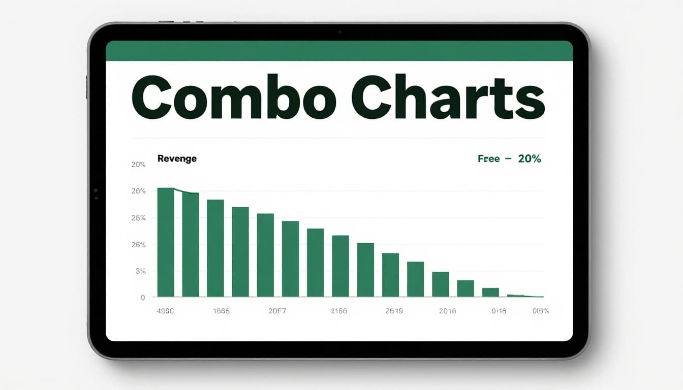
Combo Charts When Numbers Play on Different Scales
Mix columns and lines for dollars versus percentages. Revenue in thousands pairs with growth rates. One chart shows both without squishing scales.
For instance, plot actual sales as bars, targets as a line. Gaps scream “push harder here.” Separate charts force mental math. Combos save that effort.
See combo chart examples and best practices to build your own.
Pie Charts Done Right for Simple Shares of the Whole
Pies show parts of one whole. Limit to seven slices max. Budget splits work: rent 40%, salaries 30%, supplies 20%. Colors help distinguish.
Yet close slices fool the eye. 28% versus 25% looks even. Bars compare those better. Use pies for obvious shares only.

Bubble Charts to Juggle Three Data Layers at Once
Bubbles pack three variables. X-axis for revenue, Y for profit, size for volume. Big bubble in top right? High performer.
Spot clusters fast. Small profit bubbles signal fixes. Great for complex sets, but explain axes clearly.

Follow These Best Practices to Create Charts Everyone Gets
Clarity rules. Viewers should grasp comparisons in seconds. Focus on the story, not decoding.
Titles tell the point: “Q1 Sales by Region: Northeast Leads.” Label axes with units, like “$ in Thousands.” Add sources below.
Colors matter. Use 2-3 for contrast. Blues and greens for positive, reds for alerts. Test for colorblind friends.
Less clutter sharpens focus. Remove extra lines or legends if labels suffice.

Label and Title So Viewers Know at a Glance
No labels? Readers guess. Axes say “Sales” and “$K.” Data source notes “Internal CRM, March 2026.”
Before: Bare bars confuse. After: Full labels reveal winners. Trust builds fast.
Learn more in this data labels and error bars guide.
Simplify to Avoid Chart Overload
Cap categories at 7-10. Aggregate the rest as “Other.” Straight lines, no 3D tricks.
Result? Eyes lock on differences. Comparisons pop.
Show Uncertainty with Error Bars
Real data varies. Error bars show ranges or confidence. Sales $250K plus/minus 10%? Bars prove it.
This adds trust. Viewers see realistic pictures.
Avoid These Traps That Muddle Your Data Message
Mistakes kill impact. Spot them, fix fast.
Pies tempt, but abuse them. Over seven slices? Chaos. Close values? Angles deceive. Bars fix both.
Multiple types jam insights. One view per chart, or combo only. Confusion drops.
Know your crowd. Execs want simple. Analysts handle details. Tailor or lose them.
This guide covers pie chart mistakes well.
Stop Pie Chart Abuse on Tough Comparisons
Ten slices? Eye strains. Bars sort high to low. Clarity wins every time.
Skip Jamming Multiple Chart Types Together
Bars plus lines plus pies? Overload. Pick one story per visual.
Match Charts to Your Viewers Skill Level
Beginners need basics. Experts dig bubbles. Ask: Who reads this?
Use Top Tools and Fresh 2026 Trends for Smarter Charts
Tools speed work. Excel starts simple. Visme adds polish. FusionCharts handles custom JavaScript. Yellowfin suits enterprises.
March 2026 leaders? Tableau for dashboards, Power BI for Microsoft fans, Looker Studio free with Google.

Pick by need: Excel for basics, Tableau for pro interactivity. See 2026 tool comparisons.
Start Easy with Excel, Visme, and Powerhouse Options
Excel charts in clicks. Visme designs fast. Power BI integrates data smooth.
Tap AI, Interactivity, and Mobile Trends Shaping 2026
AI picks types, flags outliers. Click filters explore live. Mobile views resize auto. Colorblind palettes standard.
These cut time, boost shares. Start with one tool today.
Charts changed Sarah’s meeting. Right type, clean design, no traps, smart tools.
Pick one old spreadsheet. Remake its chart. See differences yourself.
Share your before/after in comments. Which tool try next? Data mastery waits.