Imagine a sales chart for your team. Most days cluster around 50 units sold. Then one bar shoots up to 500. Everyone notices. That spike grabs attention right away.
Outliers are data points that stand far apart from the rest. They break the main pattern. Sometimes they come from errors, like a typing mistake. Other times, they flag real events, such as a viral promotion. Yet they can twist averages and mislead trends. Ignore them, and you miss chances for smart fixes.
This post breaks it down. You’ll learn what outliers mean, how to spot them in graphs like scatter plots and box plots, simple math checks, real examples, and 2026 tools with AI boosts. Ready to spot those oddballs yourself?
Understanding Outliers: The Data Points That Don’t Fit In
Outliers sit way off from most data. They differ a lot in value. Common causes include sloppy measurements or one-off events. For example, a customer enters 999 instead of 99 widgets.
These points pack power. They pull up means and warp trends. A class average jumps from 85 to 92 because one kid scores 200 by mistake. Decisions go wrong fast.
Yet outliers tell stories too. Banks catch fraud this way. Stock jumps signal big news. Always check first.
Graphs beat raw numbers for quick finds. You see strays at a glance. Numbers alone hide them in lists.
Causes vary. Here they break down:
- Errors in data entry or sensors.
- Rare natural events, like a heat wave.
- True changes, such as market shifts.
Effects hit hard. Skewed stats lead to bad calls. But smart handling turns them into wins. In short, outliers demand your time.
Visual Signs of Outliers in Your Favorite Graphs
Eyes catch outliers before math does. Common charts make them pop. Look for loners or spikes that clash.
Scatter plots show pairs of data. Box plots summarize spreads. Histograms stack frequencies. Line charts track changes over time. Bar charts compare groups.
Each reveals odd points differently. Train your gaze on edges and clusters. Pro tip: zoom in always. You’ll save hours in analysis.
For more on graph basics, check visualizations for box plots, histograms, and scatter plots.
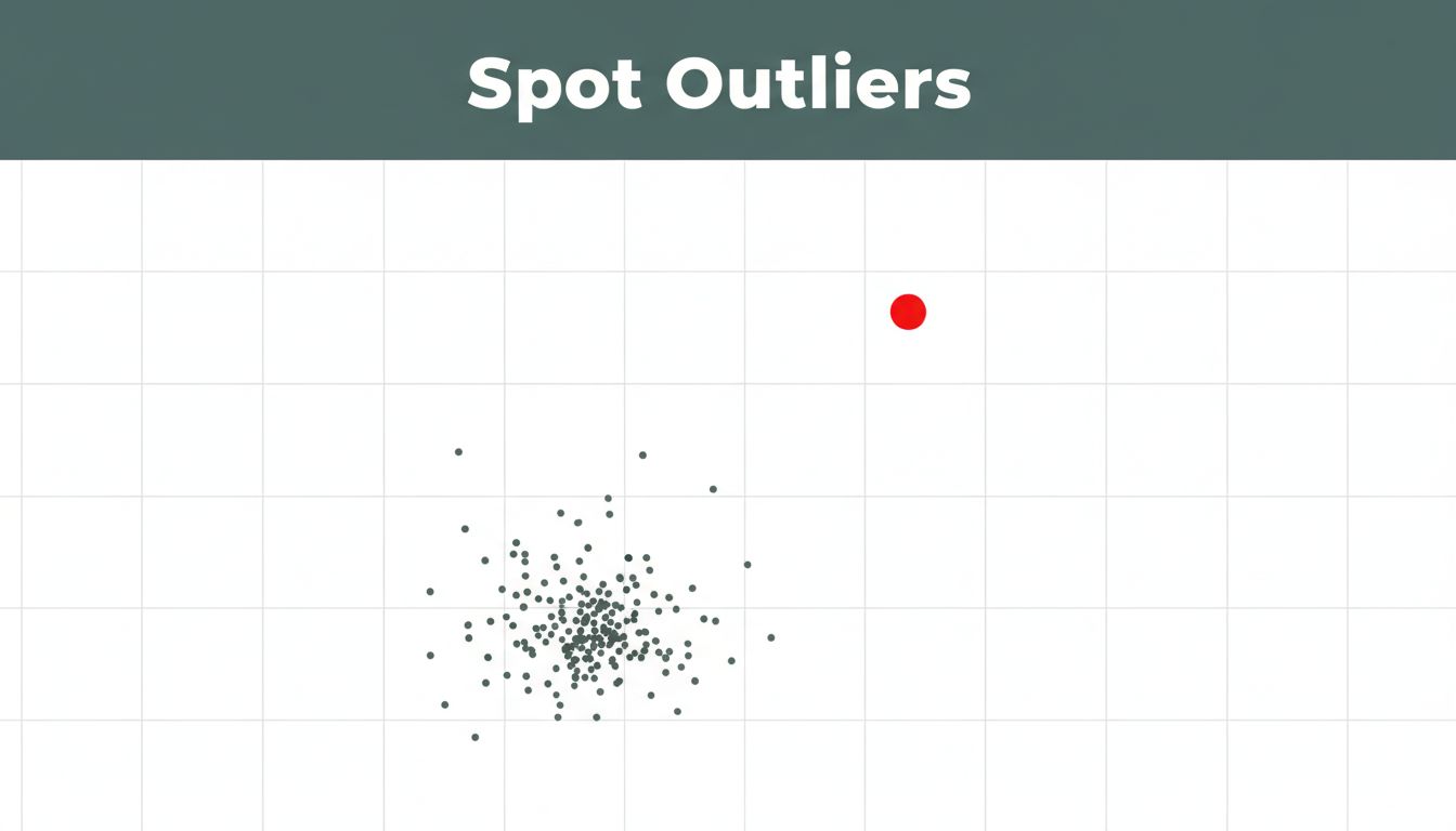
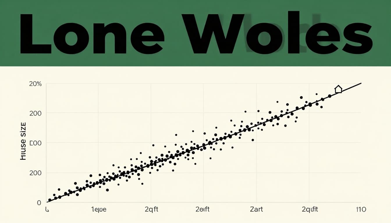
Scatter Plots: Hunting Lone Wolves Far from the Pack
Scatter plots map two variables. Dots show links, like size and weight.
Outliers look like loners. They drift far from the pack or trend line. Most points hug a line. One sits alone above or below.
Picture house prices versus size. Points follow a slope: bigger homes cost more. Then a shack priced at a million bucks floats high. Data error? Or celebrity hideout?
Draw a mental trend line. Points off by miles scream outlier.
Box Plots: Whiskers That Reveal Hidden Oddities
Box plots pack data into one shape. The box holds middle 50%. Lines, or whiskers, stretch to edges.
Outliers appear as dots past whiskers. They sit beyond 1.5 times the box width from edges.
Test scores offer a clear case. Most kids score 70 to 90. Whiskers end at 60 and 95. Dots at 20 and 110 flag issues. Cheating? Or test glitch?
Scan for those stars. They jump out fast.

See Khan Academy’s take on outliers in scatter plots for related visuals.
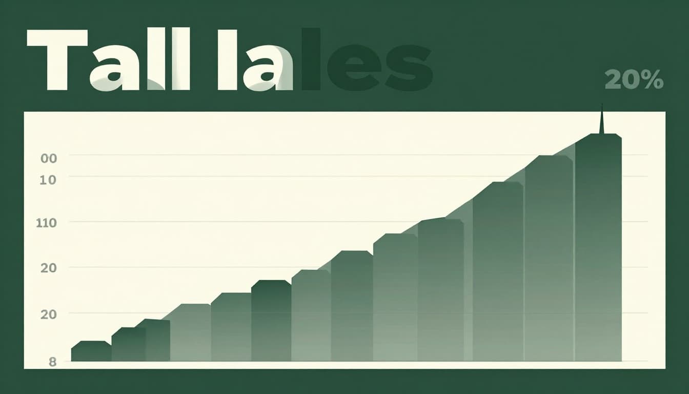
Histograms and Bar Charts: Spotting Tall Tales in the Bars
Histograms show frequencies in bins. Bars rise where data piles up.
Outliers create tail spikes. Most bars even out. One towers alone.
Daily sales fit here. Bars hover near 50. A holiday pushes one to 500. Real boom or double count?
Bar charts compare categories. One bar dwarfs others. Temps across cities stay 70s. One hits 120 from a bad sensor.
Start at edges. Tall or short bars yell outlier.
Line Charts: When One Point Breaks the Flow
Line charts connect points over time. Smooth flows show normal patterns.
Outliers jag the line. A sharp spike or plunge snaps continuity.
Stock prices climb steady. News hits; one day rockets 50% then falls. Event driven? Or fat finger trade?
Check neighbors. Isolated peaks stand out. Context matters.
Double-Check with Simple Math: IQR and Z-Score Basics
Visuals hint. Math confirms. Two easy methods work well.
IQR stays simple. Sort data. Find Q1 (25th spot) and Q3 (75th). Subtract for IQR. Lower fence: Q1 minus 1.5 IQR. Upper: Q3 plus 1.5 IQR. Points outside flag outliers.
It ignores shapes. Great for skewed data.
Z-score fits normal curves. Subtract mean from value. Divide by standard deviation. Over 3 or under minus 3? Outlier.
Use Z for bell shapes. IQR anywhere else.
Match to graphs. Box plot whiskers use IQR. Scatter Z helps trends.
Try Python code for IQR and Z-score detection. Plug in numbers fast.
| Method | Best For | Threshold |
|---|---|---|
| IQR | Any shape | 1.5 x IQR |
| Z-Score | Normal data | |3| or more |
These checks pair with eyes. False flags drop.
Real-World Outlier Stories from Graphs You’ll Recognize
Stories stick. House prices scatter: cluster trends up. Shack at top price. Turned out a data mix-up with luxury condo.
Student box plot: low dots from no-shows. High one? Prodigy or leak.
Sales histogram: tail spike on Black Friday. Kept it; planned better promos.
Stock line: spike from merger news. Insight, not error.
City temps bar: 150F bar. Sensor fail. Dropped it clean.
What would you do? Investigate always. Remove only errors. Keep gems.
Graphs guide choices. Lessons save time.
Top Tools and Tricks for Outlier Detection in 2026
Tools speed hunts. Start free. Excel or Google Sheets box plots flag dots quick.
Plotly shines interactive. Hover sees details. Tableau extensions auto-highlight anomalies, like this Anomaly Detect add-on.
Python rules 2026. Scikit-learn packs Isolation Forest. It isolates outliers fast in big sets. LOF checks local density.
AI trends mix stats and ML. Robust Z-scores ignore skews. Graph tools like Outgraph scan networks.
Tricks help: color suspects red. Zoom plots. Test multiple methods; they differ.
You need no pro setup. Sheets starts you. Dashboards evolve with data.

Outliers sharpen your edge. Spot them in graphs with eyes and math. Examples show stakes. Tools make it easy.
Grab your data now. Plot a chart. Hunt those strays. Share your finds in comments. What outlier surprised you most?