Remember that viral chart from a 2025 news story? It showed a company’s sales jumping from 100 units to 105, but the y-axis started at 90. Everyone thought it was a massive boom. In reality, it was just a 5% bump.
Graphs pop up everywhere now. You see them in news feeds, work reports, and ads. A quick glance can lead you astray because creators sometimes tweak them to push a point. Misinterpreting graph data costs time, money, or bad votes.
This post breaks it down. You’ll learn sneaky tricks to spot, simple steps to read charts right, and fresh 2026 examples. By the end, you’ll handle any graph like an expert and make sharper calls.
Spot the Sneaky Tricks That Make Graphs Lie
Graphs fool eyes in quiet ways. People miss clues because our brains love patterns. Common graph interpretation mistakes include stretched scales and odd shapes. Spot them fast, and you stay ahead.
Creators use these for drama. Viewers react without checking. For example, news sites amplify small wins. Always pause and scan.
Truncated Axes Turning Tiny Changes into Giant Leaps
Truncated axes skip zero on the y-axis. A rise from 80 to 85 looks like a rocket. Your eye ignores the missing base.
They do this to hype small shifts. Think Paralympics race times or stock ticks. The full picture shows flat lines.
Fix it easy. Mentally drop to zero. Check the range label. Ask if zero fits the story.
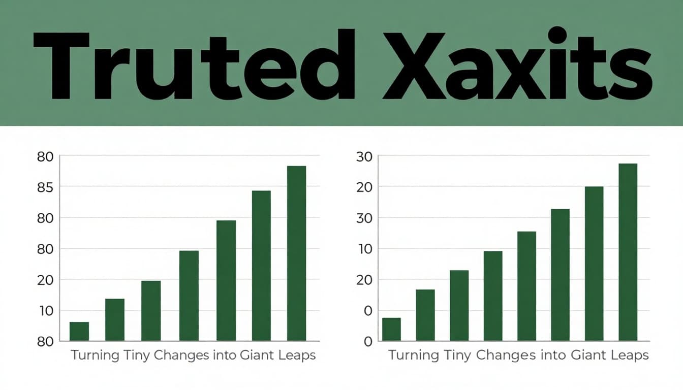
In short, full scales tell truth. Half ones sell hype.
3D Charts and Weird Shapes That Distort Sizes
3D effects warp views. Pie slices up front seem twice as big. Depth tricks your brain on area.
Cones or bars do worse. Amazon revenue charts from 2025 used this. Front parts dominated.
Ignore the angle. Read labels only. Flat 2D shows real shares.

Besides, 3D hides overlaps. Stick to simple shapes.
Dual Axes and Cluttered Labels Hiding the Truth
Dual axes pair unrelated lines. One climbs sales, the other jobs. They sync by chance, not cause.
No units like % or $ confuses more. Legends mix colors wrong.
Match each line to its axis. Demand clear marks. If missing, skip the graph.
For deeper fixes on these issues, check examples of misleading graphs and how to spot them.
Wrong Chart Choices Leading to False Trends
Pies work for few slices only. Many parts blur. Lines link unrelated categories by mistake.
Cumulative totals hide drops. One 2025 wind energy chart stacked gains. Real output fell.
Use bars for compares. Lines track time. Match type to data.
These tricks spread fast online. Know them, and you cut through noise.
Master These Steps to Read Any Graph Right the First Time
Build habits now. These six steps work every time. Practice on news sites daily.
First, question source. Second, check axes. Third, read numbers. Fourth, grab context. Fifth, redraw mentally. Sixth, test causation.
They save you from traps. Start small, then speed up.
Start by Questioning the Source and Full Story
Who built the graph? Check dates for cherry-picks. Long trends beat short spikes.
Footnotes explain jumps. Cross-check raw data online. If hidden, doubt it.
For instance, a quick search shows full sets. This stops spin.
Dive into Axes, Scales, and Labels Before Anything Else
Zero on y-axis? Units match? Time runs left to right.
Legends align colors. No tricks there, move on.
Miss this, and rest fools you. Always first stop.
See data visualization best practices to overcome common mistakes for more on scales.
Trust Numbers Over Eye Tricks and Verify Trends
Eyes lie with colors or curves. Hover for exact values.
Small samples smooth wiggles. Check n-size. Trends need context.
Numbers win. Eyes suggest.
Real-World Graph Fails from 2025 and How to Spot Them Next Time
2026 news repeats old sins. White House steel chart in 2025 yelled “American steel is BACK.” Y-axis skipped zero. Tiny uptick looked huge.
Apply steps. Source: official release. Axes truncated. Numbers: weak gains. Full view shows stall.
BBC avocado toast index mangled scales. House prices versus snacks seemed equal crises. No math linked them.
Crime headlines screamed 200% rise. From one to three cases. Percentages scare, totals matter.
A viral AI dots graphic used 2,500 points wrong. Grey “never used” swamped truth. Read why that viral 2,500 dots AI graphic is more misleading.
Election polls added 3D bars. Sizes twisted votes.
Next time, audit with steps. Share your fixes online. Spot early, share wide.
Pull It All Together for Smarter Graph Reads
Graphs trick, but you know pitfalls now. Follow steps daily. Learn from 2025 flops like steel charts.
Avoid misinterpreting graph data sharpens choices at work or polls.
Grab your next news graph. Run the check. Spot a blunder? Drop it in comments below.
Subscribe for weekly data tips. Stay sharp out there.