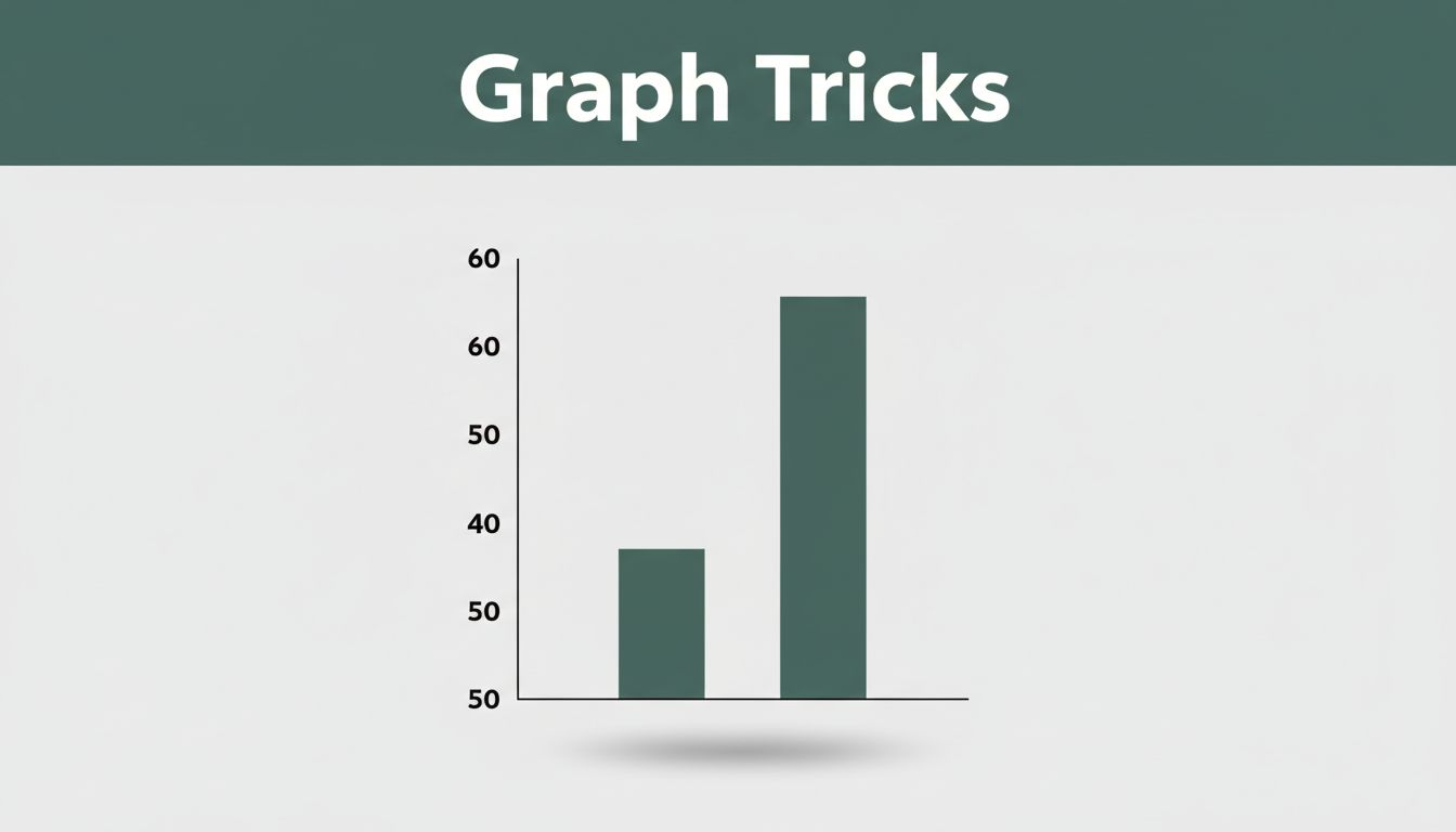
Imagine scrolling social media in March 2026. You spot a bar graph from a tech company. Sales jumped 20%, from 50 to 60 units. The bars tower over each other because the Y-axis starts at 50, not zero. That modest gain looks explosive.
You see these graphs everywhere, in news stories, ads, and reports. They shape opinions on sales, crime, or health. Scale and units decide the story a graph tells. A small tweak hides truth or hypes hype.
This post breaks it down. You’ll learn how scales stretch facts, units mix confusion, real 2026 cases, and tips to spot tricks. Ready to read graphs like a pro?
How Graph Scales Turn Tiny Shifts into Giant Stories
Graph scale means the numbers and range on the axes. Think of the starting point and steps between ticks. It sets fair comparisons or fools them.
Start the Y-axis above zero, and small changes explode visually. A company sales bar from 50 to 60 rises 20%. Yet the bar doubles in height. Viewers think growth doubled too. Proper scales begin at zero for true proportion.
Uneven intervals skip data points. A line graph might jump years, hiding dips. Trends look smoother than reality. Log scales compress big jumps without labels. Exponential growth seems flat.
Data experts warn these choices lead to misinterpretation. For more on why truncated axes mislead, check Tableau’s analysis on Y-axis truncation. Scales act like a zoom lens on a map. Get too close, and hills look like mountains.
The Truncated Axis Trap Everyone Falls For
Most folks miss this trick. The Y-axis skips zero on purpose. Picture 2026 news on gun deaths. One graph starts high and flips downward. Deaths seem to plunge after new laws. Redraw it from zero, and the drop vanishes or turns into a rise.
Simple math proves it. Sales go from 50 to 60, a 20% gain. Bars from 50 make it look 100% bigger. Ads love this for quick hype. Reports on jobs or welfare do the same.
Always test by imagining zero. Does the story hold? Canstar Media details the ethical issues. Spot it early, and you avoid the trap.
Dual Axes and Why They Almost Always Confuse
Dual axes pile two scales on one graph. Left side shows GDP in trillions. Right tracks something in billions. Lines cross wrong because units mismatch.
America’s line climbs fast against world data. It looks dominant until you convert scales. Trends fake links. Sales rise 50%, stock 200%. They sync visually, but scales hide weak ties.
Experts say skip dual axes. Use one per graph or separate charts. Convert units first if needed. Flourish explains when they work or fail. Confusion drops fast.
Units Mix-Ups That Hide the Real Data Picture
Units label the data, like dollars or Celsius. Wrong ones fool quick scans. A salary bar in thousands towers over one in plain dollars. Gaps exaggerate.
Energy reports switch mid-graph. Thousands become millions without notice. Steady lines mask huge growth. Pictograms use icons. Double the size, but 3D makes volume eight times bigger.
It’s like apples versus oranges. Check labels first. The Library Research Service shows Y-axis manipulation examples, but units add another layer. Mismatches warp the full picture.
Sneaky Unit Switches in Reports and Charts
Reports hide switches at edges. An energy line stays flat. Early labels say thousands. Later, millions kick in. Growth hides in plain sight.
Fahrenheit to Celsius flips trends. A warming line cools without warning. Hunt labels at both ends. Recent 2026 avocado toast indexes skipped clear ties to housing costs. Prices seemed equal everywhere.
Spot them by pausing on axes. Full context changes everything.
3D Tricks and Pictograms That Warp Sizes
3D icons distort worst. House sales pictograms grow double in height. Area squares it to four times. Volume cubes to eight.
Flat 2D bars stay honest. Stats sites note millions fall for these in 2026 ads. Statistics How To lists real misleading graphs. Stick to simple shapes.
Fresh 2026 Examples of Graphs Gone Wrong
Graphs tricked eyes all year. Company ads cropped sales bars. News flipped crime stats. Dual axes faked global ties. Mixed units hid salary gaps.
Recent media reports and data sites exposed them. Full data flipped stories. You feel the pull too.
Company Hype with Cropped Sales Bars
Tech firms showed bars from 50 to 60 units. Explosive growth screamed. Zero baseline revealed 20% reality. Ads pushed stock buys on lies.
News Flips on Crime Stats After New Laws
2026 gun death graphs inverted Y-axes. Shooting deaths dropped 14% to 14,651, lowest since 2015. But suicides hit records at 27,593. Total violence stayed high at 44,447. Post-law “drops” vanished from zero. Full view showed mixed results.
Smart Tips to Read Any Graph Without Getting Fooled
Master these habits. Start with Y-axis at zero unless labeled why not. Match units across bars. Use even intervals, no skips. One axis only. Simple 2D shapes.
Read axes first, labels next. Redraw mentally from zero. Check raw numbers behind. Experts push full data access.
Practice on news graphs. Trust builds fast.
Your Quick Checklist for Every Graph
Scan these steps each time:
- Does Y-axis start at zero? If not, why?
- Match all units and scales.
- Even intervals? No hidden skips.
- Single axis? No dual tricks.
- Flat 2D? Skip 3D warps.
- Verify with numbers.
Use this, and tricks fade.
Scale and units control every graph’s tale. 2026 cases like gun stats and sales hype prove it. Now you spot them.
Next graph you see, pause. Check axes and labels. Share this with friends fooled by charts. What tricked you lately? Comment below.
Spot more in science or ads. Stay sharp.