You scroll social media and see a bar chart showing skyrocketing crime rates. It looks alarming. Shares explode, opinions shift overnight.
Misleading graphs twist data to sell a story. They appear in news, ads, and politics. These visuals sway views on health choices, investments, or votes because our brains trust pictures more than numbers.
This post breaks down common tricks graph creators use. Then it shares quick spotting tips and real examples from recent headlines. Ready to see through the deception? Let’s start with the sneaky tactics.
Sneaky Tricks Graph Makers Use to Fool You
People make graphs to persuade. Our eyes grab patterns fast, so small changes turn huge with the right tweaks. Experts note these distortions work because brains skip details for quick reads.
Creators exploit that. They alter scales or pick data to fit narratives. Common types include manipulated axes and cluttered designs. Each fools you differently, but patterns repeat.
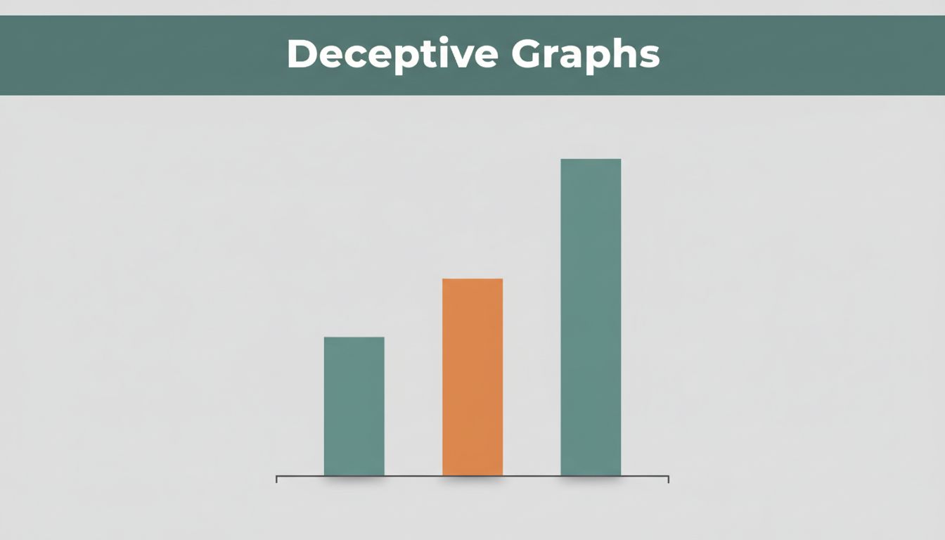
Truncated or Manipulated Y-Axes That Exaggerate Changes
Graph makers start the y-axis above zero. A rise from 80 to 100 looks like a rocket launch. In truth, it’s just 25% growth.
Stock reports love this. Sales climb from 81.6 to 81.8 million tons? Bars soar if the axis skips zero. Viewers panic or cheer without checking scale.

Mentally drop the base to zero. Does the change still impress? That fixes most hype.
Dual Y-Axes Creating Fake Links Between Data
Two y-axes pair unrelated stats. Ice cream sales rise with drownings? Plot them together, lines dance in sync. Causation seems real.
Scales rarely match. One line climbs slow, the other shoots up. Crossovers imply direct ties. Budget graphs pit military spending against rivals this way.
Check if metrics connect logically. Align scales yourself. No link? It’s smoke and mirrors.
Distorted Pie Charts and 3D Effects Hiding True Sizes
Pie charts cram too many slices. Viewers guess sizes wrong. Add 3D tilt, front pieces bulge bigger than back ones.
A 30% share dwarfs a 28% neighbor. Totals might not add up either. Bar charts fix this; pies rarely do.
Switch to bars in your mind. Equal widths show true proportions better.
Cherry-Picking Data to Ignore the Big Picture
Grab short trends that fit your point. Temps flat from 1997 to 2012? Plot that, claim no warming. Full record shows steady rise.
Climate debates use this often. Select Antarctic ice snapshots 45 years apart. One year beats another; ignore overall melt.
Always demand the full timeline. Short clips hide context.
Other Red Flags Like Missing Labels or Odd Shapes
Bars widen at the base for drama. Fonts shrink to hide sources. No labels mean no questions.
Stretch shapes vertically, growth explodes. Clutter buries key facts.
Scan basics first. Clear labels build trust; odd designs scream caution.
Simple Checks to Spot Misleading Graphs Instantly
You spot tricks fast with practice. No math degree needed. Data pros teach these steps; apply them anywhere.
Start with axes. Then hunt data gaps. Question extras. Verify sources. That routine takes seconds.
Scan Axes, Scales, and Zero Points First
Eyes go left to y-axis. Does it hit zero? Even ticks help judge size.
Multiple axes? Match ranges. Increments jump? Red flag.
Do this before details. Scale sets the story.
Hunt for Hidden or Incomplete Data
Full timeline shown? All categories? Source credible?
Cherry-picks omit drops or rivals. Ask what’s left out.
Context reveals truth.
Question Fancy Visuals and Read Every Fine Print
3D spins hide slices. Fancy fills distract.
Enlarge labels. Totals match? Data add up?
Plain graphs win; effects often cheat.
Verify Against Original Sources Yourself
Cross-check facts. Use tools like Google Fact Check Tools or raw sites.
Compare graphs. One version clean, another twisted? Distrust the spin.
Real-World Graphs That Tricked Headlines and Voters
Graphs shape news cycles. Recent cases prove it. A 2026 White House post claimed steel boomed. Bars showed huge jumps from 2024 to 2025.
Y-axis started at 80.2 million tons, not zero. Tiny 0.2 million ton rise looked massive. Critics added notes; truth emerged small.
See the White House steel production graph breakdown. Public outrage followed.
Fox News graphs persist too. Unemployment bars started high, like 34%. Real rate 8.6% spiked to look worse. Viewers bought the panic.
Details in NBC’s Fox graphics analysis. Politics swayed.
Climate charts cherry-pick. Antarctic ice graphic compared 1979 to 2024 snapshots. One bigger; claim no warming.
Full data shows decline trend. Reuters fact-checks it here.
Crime stats hide years. Short spikes ignore drops. Gun death graphs flip axes; declines flip to rises.
Election polls zoom tight scales. 1% leads look landslides. Media amplifies.
Lessons stick. Impacts hit opinions hard. Voters shift, policies change. Spot once, doubt spreads.
Spot Deception, Demand Truth
Truncated axes exaggerate. Dual scales fake ties. Cherry-picks ignore facts.
Check zeros, sources, and labels every time. Simple visuals rarely lie.
Next graph? Pause and scan. Share your finds below. Quiz friends on charts. Master spotting misleading graphs now. You’re graph-proof.
(Word count: 1,472)