Ice cream sales spike in summer. So do sunburn cases. Does eating more cones cause burns? Of course not. Yet graphs often show these trends lining up perfectly.
People mix up correlation and causation all the time. This leads to silly business choices, flawed health advice, or weak policies. You see a pattern in data and jump to wrong conclusions.
This post clears it up. You’ll learn what each means, how they look in graphs, and tricks to spot the difference. First, we define correlation. Then causation. Next come pitfalls and real examples. Finally, get tools to check any graph.
Spotting Correlation: When Data Points Dance Together in Graphs
Correlation happens when two things move in sync. One does not cause the other. They just share a pattern.
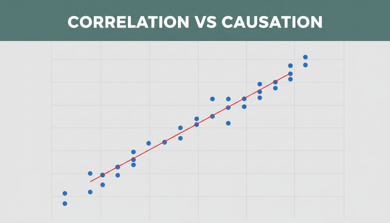
Picture a scatter plot. Dots show data points for two variables. If they hug a line, correlation exists. Height often pairs with weight. Taller folks tend to weigh more. That’s positive correlation. Both rise together.
Hours studied link to test scores too. More study time usually means higher marks. However, a lurking factor might play a role. Correlation spots the dance. It does not explain the music.
The correlation coefficient, called r, measures this. Values run from -1 to 1. Close to 1 means strong positive link. Near -1 shows strong negative. Zero means no pattern.

Visual Clues in Scatter Plots and Line Graphs
Scatter plots reveal links best. Dots form an uphill line for positive correlation. Downhill means negative. Random scatter shows none.
Tight clusters signal strength. Loose dots mean weak ties. Imagine plotting friends’ ages against candy eaten yearly. Dots spread everywhere. Low correlation.
Line graphs connect points over time. Rising lines together hint at positive correlation. Falling ones show negative. Still, no cause proven. For interactive scatter plot examples, check this guide on detecting patterns.
Strength Matters: From Weak Links to Ironclad Patterns
Weak correlation scatters dots loosely. Shoe size and reading speed fit here. Little real link.
Moderate ones cluster some. Strong patterns form near-straight lines. Temperature drives ice cream sales. Hot days boost both.
Even ironclad patterns lack causation. They flag trends for deeper checks. Strong r values tempt mistakes. Always dig further.
Unpacking Causation: Proof That One Thing Drives the Other
Causation means one variable changes another. You need proof. Controlled tests rule out extras.
Graphs show association. They miss why. Ice cream and sunburns correlate. Heat causes both. No direct drive.
Randomized trials set the standard. Split groups. Expose one to the factor. Compare results. This isolates cause.

What Makes Causation Rock Solid
Cause comes first. Effect follows. Studies repeat findings. Alternatives get ruled out.
Smoking offers proof. It precedes lung cancer. Trials link it directly. Graphs alone fall short. Decades of data seal it.
Consistency across groups strengthens claims. One study does not suffice. Multiple ones build the case.
Why Graphs Trick Us: Common Pitfalls in Correlation vs Causation
Shiny graphs with matching lines fool eyes. We assume cause too fast. Spurious links pop by chance.
Confounding variables hide. A third factor drives both. Reverse order flips logic too.

Confounding Variables: The Hidden Third Wheel
Summer heat boosts ice cream sales and crime. Heat confounds. It fuels tempers and treats. Ice cream stays innocent.
Pool drownings rose with nuclear plants. Population growth drove both. No reactor drownings.
Check for lurkers first. They explain synced rises.
Spurious Correlations: Hilarious But Dangerous Mix-Ups
Master’s degrees awarded match movie tickets sold. Population booms cause both. Laughable, yet headlines bite.
Divorces in Maine track margarine use. Pure coincidence. Sites like Tyler Vigen’s spurious correlations collect these gems. They warn against rash calls.
Real-World Graphs That Mix Up Correlation and Causation
Media graphs scream alarm. Ice cream sales climb with sunburns. Perfect line. Heat confounds.
Violent crime follows suit. Hot weather irks folks. Pools and drownings sync too. Swimmers multiply in summer.
Nicholas Cage films link to drownings in graphs. Absurd. For more brilliant misleading charts, see classic cases. News chases clicks. Skip deep proof.
Your Toolkit: How to Tell Correlation from Causation in Graphs
Question every graph. Use these steps.
- Hunt third factors. Does one explain both?
- Check timelines. Does change A precede B?
- Seek experiments. Observations tempt errors.
- Test logic. Does it pass common sense?
- Review studies. One graph rarely proves all. For real examples of confusion, explore these six cases.
Apply them daily. News, work reports, ads all mislead.
Correlation flags patterns. Causation demands rigorous proof. Ice cream stays safe from blame. Graphs tempt quick leaps.
Pause next time. Run your checklist. Spot tricks confidently.
Share this with friends fooled by data hype. Make smarter calls in life. Your decisions improve fast.