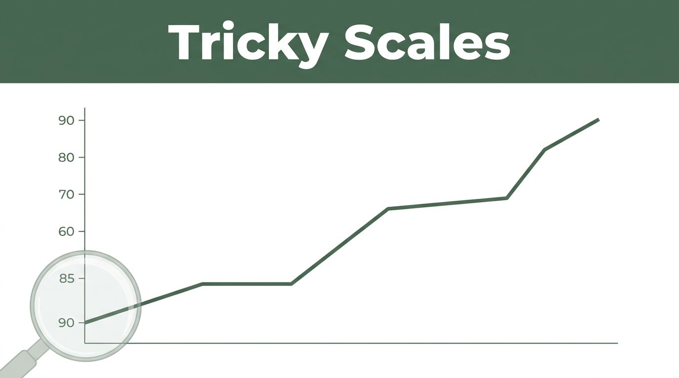
Imagine scrolling through your news feed. You spot a stock chart showing a sharp rise from $95 to $105. It looks like a winner, so you invest your savings. Days later, the price dips back. Why? The y-axis started at 90, not zero. That tiny bump seemed huge.
Graphs pop up everywhere: ads promise big sales jumps, news reports climate shifts, work dashboards track metrics. Beginners often miss subtle tricks. These lead to bad choices in money, votes, or reports. You see trends that aren’t there or changes that exaggerate reality.
This post covers top pitfalls like tricky scales, bad comparisons, fake trends, and visual deceptions. You’ll learn quick checks to spot them. Soon, you’ll read graphs with confidence and avoid costly errors.
Falling for Tricky Scales and Axes First
Scales set the stage for any graph. Beginners glance at bars or lines and judge fast. They skip axes details. This lets creators stretch truths.
Axes often start high, not at zero. Or labels mix units. A temperature graph might skip zero to show warming as steeper. Sales could read “in thousands” on one bar, “millions” on another. You think growth exploded. In truth, it crawled.
Why rush past these? Eyes focus on shapes first. Brains fill gaps. Always pause. Scan left y-axis and bottom x-axis. Note start points and steps between ticks.
Recent example hit headlines. In February 2026, the White House shared a steel production bar graph. It claimed big gains from 2024 to 2025. Bars looked doubled. Reality showed just 1.2% uptick, from 80.8 to 81.8 million tons. They zoomed the top sliver. Social media added notes calling it out.
Check CanTeach’s list of graph errors for more classics like this.
Ever seen a small gain look massive? That’s truncation at work.
When the Y-Axis Doesn’t Start at Zero
This trick stretches small shifts. A line from 95 to 105 spans the full height. It screams boom. But from zero, that 10-point rise barely nudges.
Consequences hurt. Investors buy high. Voters back wrong policies. News sways opinions.
Hunt for zero every time. If missing, picture the full range. Some graphs warn “not to scale.” Heed those. Redraw mentally or grab paper to test.
Overlooking Units and Sneaky Labels
Units hide in fine print. One axis shows percentages. Another raw dollars. You mix them. A revenue spike looks epic in logs, not cash.
Beginners skim. They assume uniform scales. Read labels aloud. Say “dollars per thousand” or “Celsius from 15.” Does it match? If not, step back.
Fix takes seconds. Saves hours of confusion later.
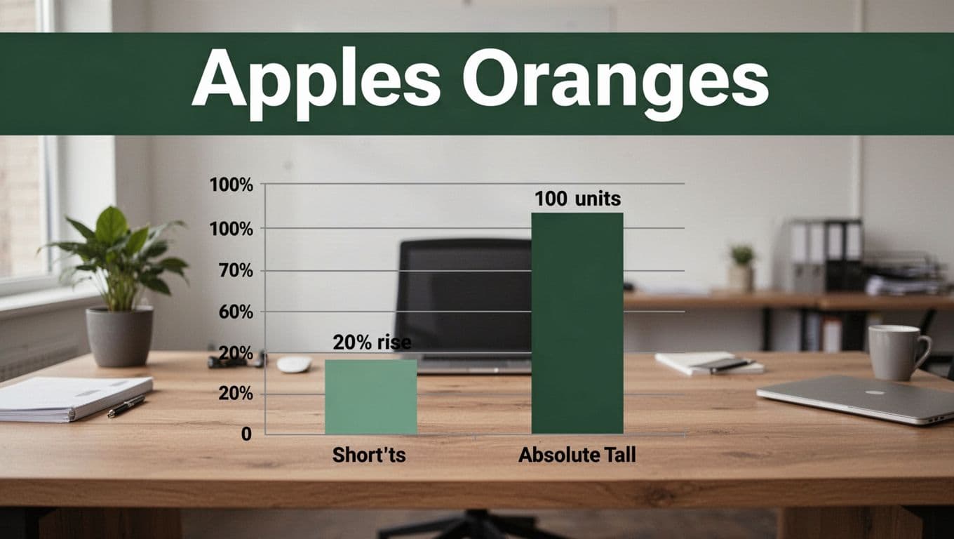
Making Comparisons Apples Aren’t Oranges
Graphs compare values side by side. Easy to mess up types. You add rates to totals or averages across groups. Results mislead.
Common slip: USA average salary plus Canada average. You call it world norm. No. Averages don’t sum like that. Rushing spots patterns blinds you to mismatches.
In business, this skews reports. Policy makers chase false leads. Match data first. Ask if numbers play nice together.
See Fun With Data’s chart mistakes guide for fixes on mismatches.
Blending Percentages with Raw Numbers
A 20% rise bar sits short next to 100 units absolute. You think units better. Percentages shift relative. Units stay fixed.
Diet ads pull this. “20% less fat” dwarfs real grams lost. Compare within types. Convert if needed.
Assuming Data Adds Up When It Shouldn’t
Rates defy addition. Speed per hour plus another? No total mph. Incomes across countries? Averages blend wrong.
Spot disconnected bars. Question sums. If graph adds them, distrust.
Seeing Trends and Connections Graphs Don’t Show
Lines suggest flow over time. Bars stand alone by category. Beginners connect dots anyway. They invent drops or rises.
Products listed A to Z look declining if sales fall alphabetically. Pure chance. Overload fools eyes too. Pies cram 12 slices. You guess sizes.
Stick to shown points. Ignore implied stories. Bad designs overload. Question order and type.
CleanChart explains why charts look wrong from poor setups like this.
Inventing Trends from Categories
Bars for cities in size order mimic time lines. Sales dip as you read down. Reorder random. Trend vanishes.
Check x-axis labels. Categories? No flow. Lines only for sequences.
Picking the Wrong Chart and Getting Confused
Pies shine for two to five slices. More? Wedges blur. Lines track time, not categories.
Wrong pick hides truths. Use bars for compares. Lines for changes over periods.
Getting Fooled by Visual Tricks and Missing Context
Designs distort. 3D bars tilt back, shorten views. Dual axes cross unrelated lines. Bubbles grow by area, not radius.
Legends cram colors. Notes explain dips as method shifts. Beginners chase visuals, skip surrounds.
Prefer flat 2D. Match legends to lines. Hunt titles and sources. Crammed charts? Bail or simplify.
ThoughtSpot covers spotting misleading graphs like dual axes tricks.
3D Effects and Shape Illusions That Warp Reality
Cones taper tops small. Bars lean, hide lengths. Eyes judge volume wrong.
Flat wins. Shadows add lies.
Dual Axes and Bubble Size Surprises
Left axis dollars, right percentages. Lines sync by accident. Bubbles double area for radius hikes.
Note scales. Align units or skip.
Skipping Titles, Sources, and Notes
Spike shocks without “new rules applied” footnote. Sources confirm data.
Read top, bottom, sides first. Context reveals all.
Graphs trick because creators rush or push agendas. You hit four traps: scales, comparisons, fake trends, visuals.
Follow these five rules:
- Check axes and labels fully.
- Match data types before comparing.
- Question shapes and implied links.
- Read titles, sources, notes always.
- Practice on daily news graphs.
Test one today. Spot a trick? You’ll smile.
Share your worst graph fail in comments. Subscribe for more data tips. Master this, and info overload loses power.