Imagine slicing a pizza among friends. One grabs the biggest piece, another takes a smaller one. You see right away who got the most.
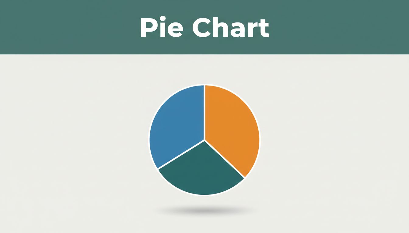
A pie chart works the same way. It shows a circle split into slices. Each slice stands for a category’s share of the whole. People love them because you spot the largest part fast, no math needed. Businesses use them for sales breakdowns. Schools show survey results. They make data simple at a glance.
This post covers the basics. You’ll learn key parts, quick reading steps, best uses, common traps, how to make one, and smarter options. By the end, you’ll handle any pie chart with ease.
Breaking Down the Key Parts of Every Pie Chart
Every pie chart starts with a full circle. That circle equals 100 percent or the total amount. Slices fill it based on proportions. A big slice means a big share. Small ones show minor parts.
Colors help tell slices apart. A legend explains what each color means. Labels name categories and often add percentages. Arc length and slice area let your eye judge sizes quickly.
People call it a “pie chart” because it looks like a cut pie. Think of a store’s $1,000 sales: furniture at $433, electronics at $300, clothing at $150, appliances at $100, other at $17. The furniture slice dominates.
Slices: The Stars That Tell the Story
Slices carry the main message. Their size matches the proportion. Bigger slice, larger share.
Take that pizza again. The thickest slice goes to the hungry friend. In sales, the furniture slice covers 43 percent. Research shows we judge by area first, then arc length. That makes pies intuitive.
Labels and Percentages: Your Quick Reference Guide
Labels keep things clear. They name each category right on or near the slice. Percentages tell exact shares.
Calculate them with (part divided by total) times 100. For $433 out of $1,000, that’s 43.3 percent. Good labels avoid mix-ups. For more on basics, check this pie chart guide.
Read Any Pie Chart Fast with These Simple Steps
Spot the dominant category first. Then compare others. Check if totals hit 100 percent. You’ll grasp the story in seconds.
Use budget examples. A pie might show rent at 40 percent, food at 25 percent, fun at 15 percent, savings at 10 percent, other at 10 percent. Quick scan reveals rent rules.
Real-world school time: classes 50 percent, homework 20 percent, sleep 20 percent, play 10 percent. Easy to see priorities.
Start with the Biggest Slice for Instant Insights
Eyes go to the largest slice naturally. It gives the top takeaway. In sales, furniture leads at 43 percent. That drives decisions fast.
Compare Slice Sizes Side by Side
Eyeball relatives next. Electronics beat clothing by double. Avoid charts with close sizes; they confuse. Line them up mentally for differences.
Double-Check the Math Adds Up Perfectly
Sums must reach 100 percent. Or 360 degrees if using angles. Spot errors like 105 percent. That flags bad data.
When Pie Charts Work Wonders and Pitfalls to Dodge
Pie charts excel with few categories. They shine for part-to-whole views. Limit to two to five slices. Sales by department fits perfect. Household budgets too.
Avoid them for trends or many groups. Bars handle comparisons better. In 2026, pie charts stay popular yet debated; bar charts lead for clarity.

Ideal Situations Where Pie Charts Shine Brightest
Use pies for clear wholes. Market share among three brands works well. One or two big slices dominate. Quick proportions matter most.
Top Mistakes That Make Pie Charts Confusing
Too many slices crowd the pie. Seven or more thin bits blur views. Similar sizes fool the eye. Skip pies for comparisons; use bars. Poor labels hide meanings. See common mistakes to avoid.
Build Your First Pie Chart in Minutes
Gather data first. Group into categories. Sum the total.
Calculate percentages. Convert to degrees if drawing: (percent times 360) divided by 100. Furniture’s 43.3 percent equals 156 degrees.
Tools speed it up. Excel or Google Sheets chart in clicks. Free sites like Canva work too.
Prep Your Data the Right Way
List categories and values. Furniture: $433. Total: $1,000. Simple table helps.
| Category | Amount |
|---|---|
| Furniture | $433 |
| Electronics | $300 |
| Clothing | $150 |
| Appliances | $100 |
| Other | $17 |
Totals confirm 100 percent.
Pick Easy Tools and Draw It Out
In Excel, select data, insert pie chart. Colors auto-assign. Hand-draw? Start at top, measure arcs with protractor. Label clearly.
Smart Swaps: Better Chart Options Than Pie Sometimes
Many categories? Switch to bars. They compare lengths easy. Trends over time need lines.
Donut charts mimic pies but add center stats. Tables give exact numbers. For precision, explore alternatives here.
In 2026, interactive dashboards rule. AI picks charts auto. Pies fit simple parts, but choose wisely.
Pie charts break wholes into clear parts. You now know their pieces, reading tricks, strong spots, traps, build steps, and swaps. They grab attention fast for budgets or sales.
Grab your data. Make a pie today. Spot the big slices. Share what surprises you. Next time data hits, you’ll interpret with confidence. Choose the right tool each time.